505 Hatch Magic
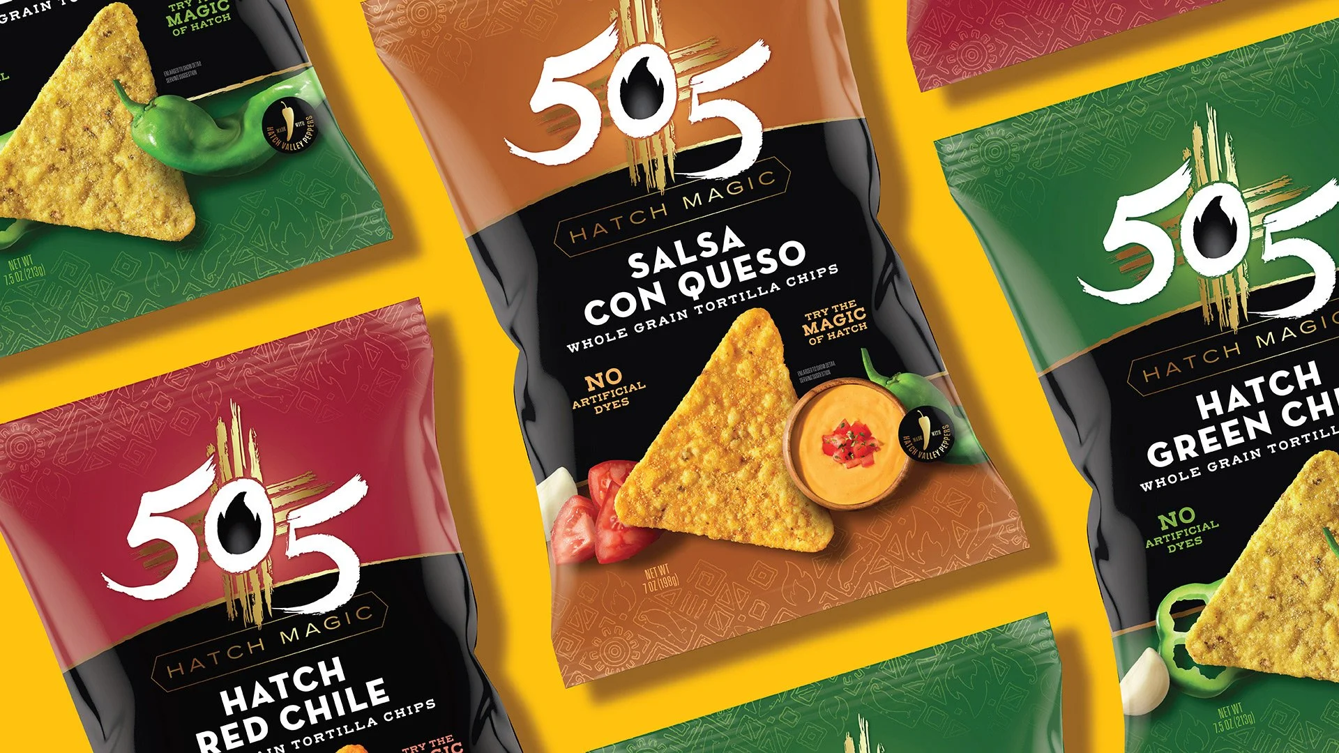
505 Hatch Magic Chips needed a packaging refresh that could capture attention in a crowded snack aisle while honoring the brand’s Southwestern roots. The existing design lacked the vibrancy and modern appeal to excite today’s adventurous snackers.
The challenge was to balance heritage and craveability – communicating the bold, premium Hatch chile flavors, reinforcing 505’s reputation for quality, and standing out against a growing number of competitive snack offerings.
Creative Challenge
Solution
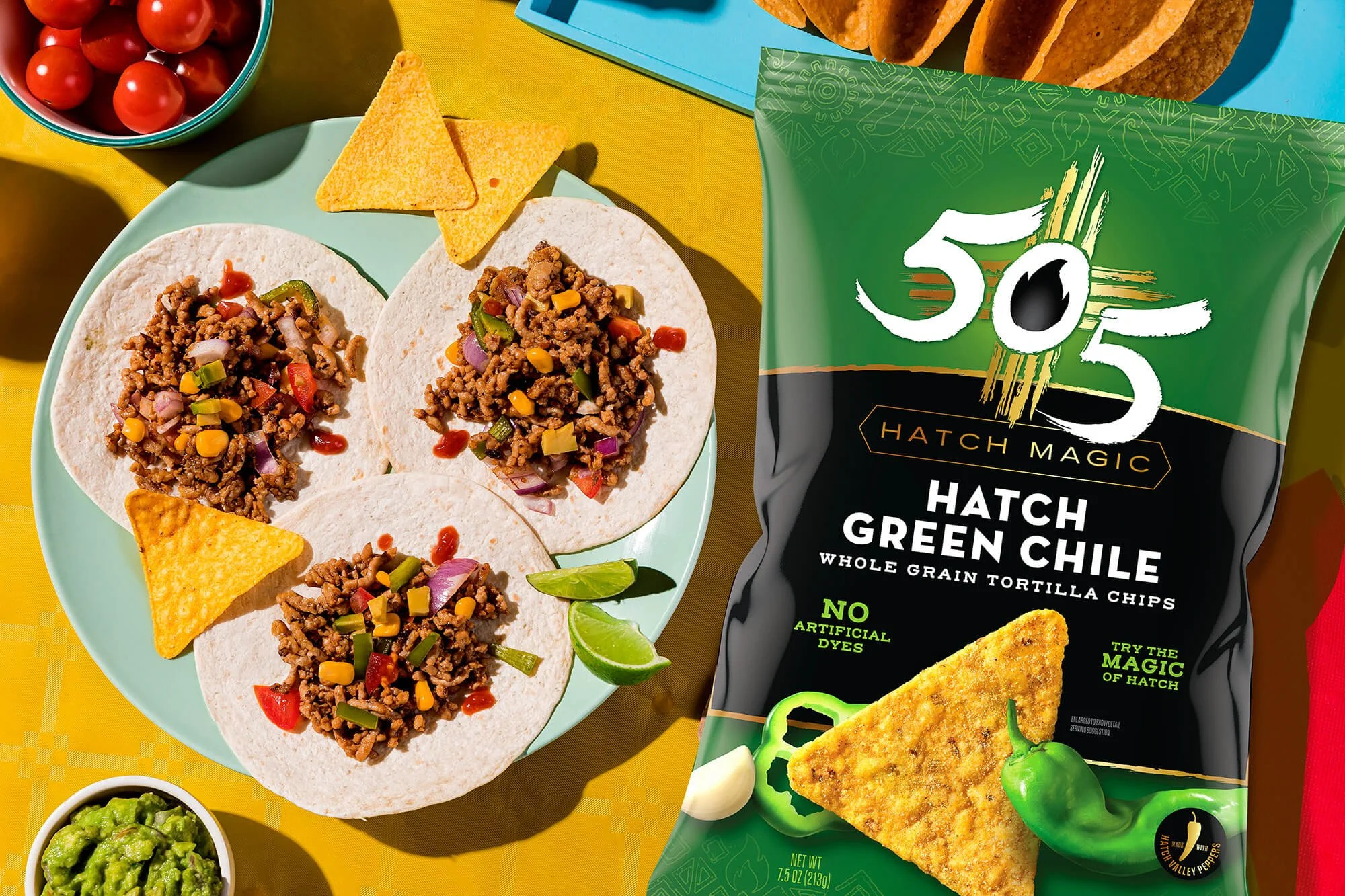
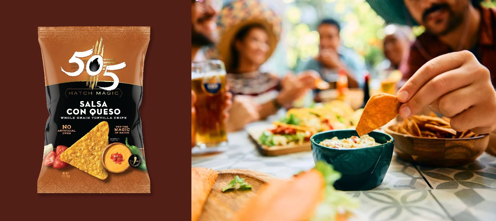
We designed a bold, dynamic visual identity that puts flavor front and center. Rich, earthy colors and contemporary typography evoke the Southwest and the brand’s premium positioning. Flavor-forward product photography highlights the Hatch chile experience, creating immediate appetite appeal.
Every element– from color and typography to imagery – was crafted to enhance shelf presence and bring the brand’s story to life, making each bag feel vibrant, authentic, and irresistible. The result is packaging that celebrates heritage while feeling modern and craveable.
Brand Design Strategy
Packaging Design
Portfolio Architecture
Visual Identity
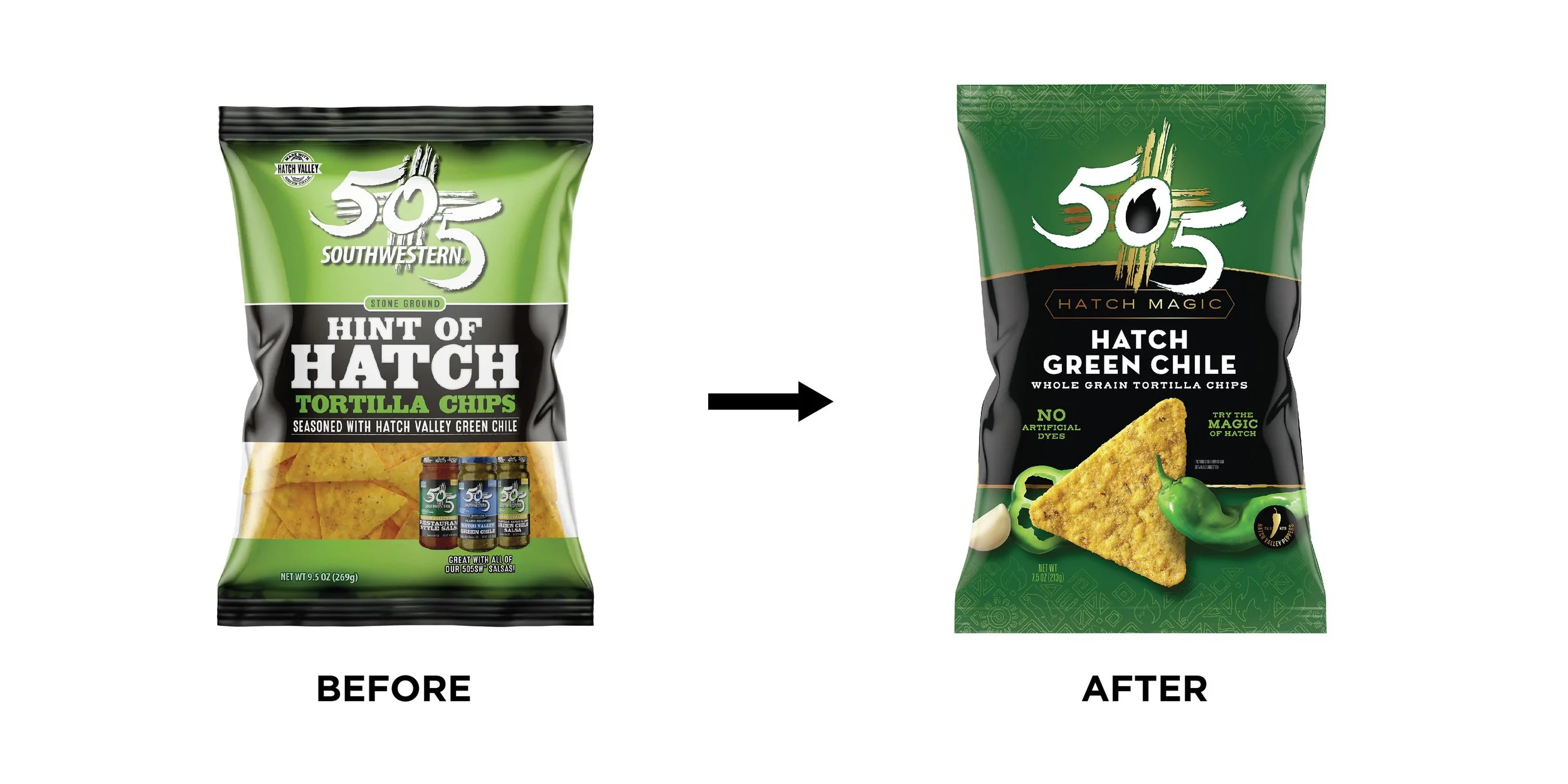
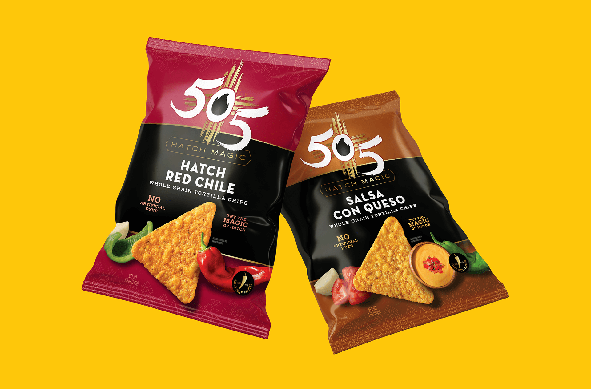
The 505 Southwestern logo is a deep nod to the brand’s roots in Albuquerque, New Mexico, using the 505 area code as a genuine badge of authenticity. The brushstroke-style numerals and the flame sitting right in the center of the "0" speak to the hand-crafted quality and the fire-roasted soul of the Southwestern kitchen. It isn't just a mark. It’s a stamp of origin that captures the fiery spirit of the brand's history and its commitment to real ingredients.
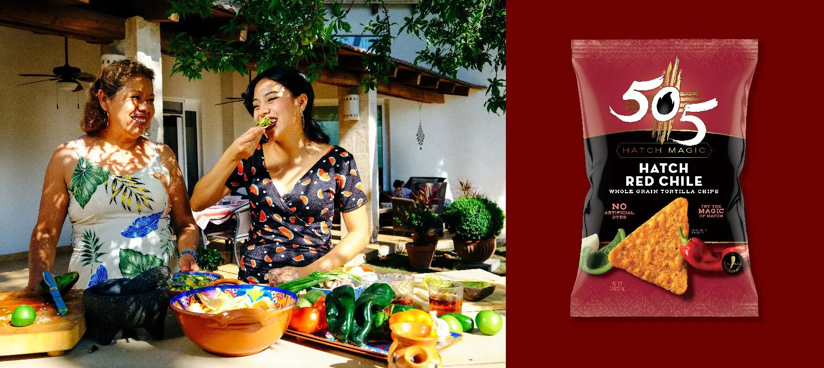
The 505 Southwestern packaging architecture tells a rich story of regional pride and bold flavor, centered entirely around the legendary heat of the Hatch Valley. When you look at the bags, the layout uses a hero chip as a clear focal point, which makes navigation feel effortless. Your eyes move naturally from the bold flavor names to the fresh ingredients, like those smoky Hatch Red Chiles or the creamy dip in the Salsa Con Queso.

“Anna is an outstanding designer with a wealth of experience under her belt with a proven track record of delivering high quality work. She is capable of managing multiple projects simultaneously, is responsive to feedback and is capable of quickly pivoting to accommodate a change in scope or direction. Highly recommend.”
Lee Nelson
Head of Marketing at Insignia International