Architecting Target’s flagship masterbrand to scale across thousands of SKUs while standing toe-to-toe with national giants.
Market Opportunity
As Target’s flagship owned-brand food line, Good & Gather had an ambitious goal: democratize access to delicious, high-quality food at scale and change how people see private label. Moving away from copy cat and creating a truly desirable brand in it’s own right.
With a portfolio spanning thousands of SKUs and dozens of categories, the challenge wasn’t designing individual packages. It was building a flexible brand system that could:
Make private label feel accessible, not cheap
Elevate taste as the primary decision driver
Work cohesively across everyday staples and premium offerings
Scale seamlessly across categories, price tiers, and shopper missions
All while unmistakably delivering the Joy of Target in the grocery aisle.
Outcome
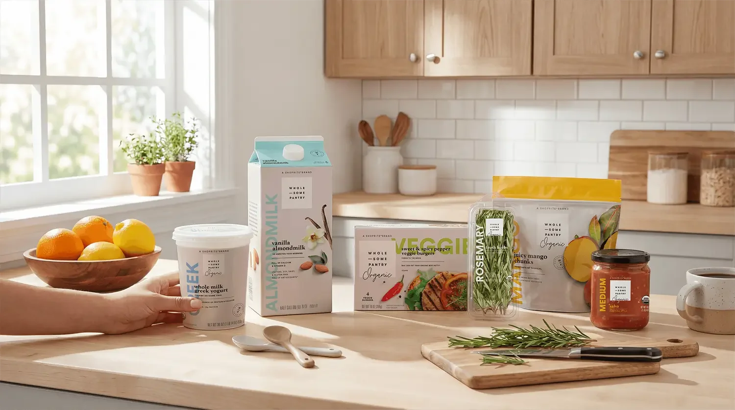
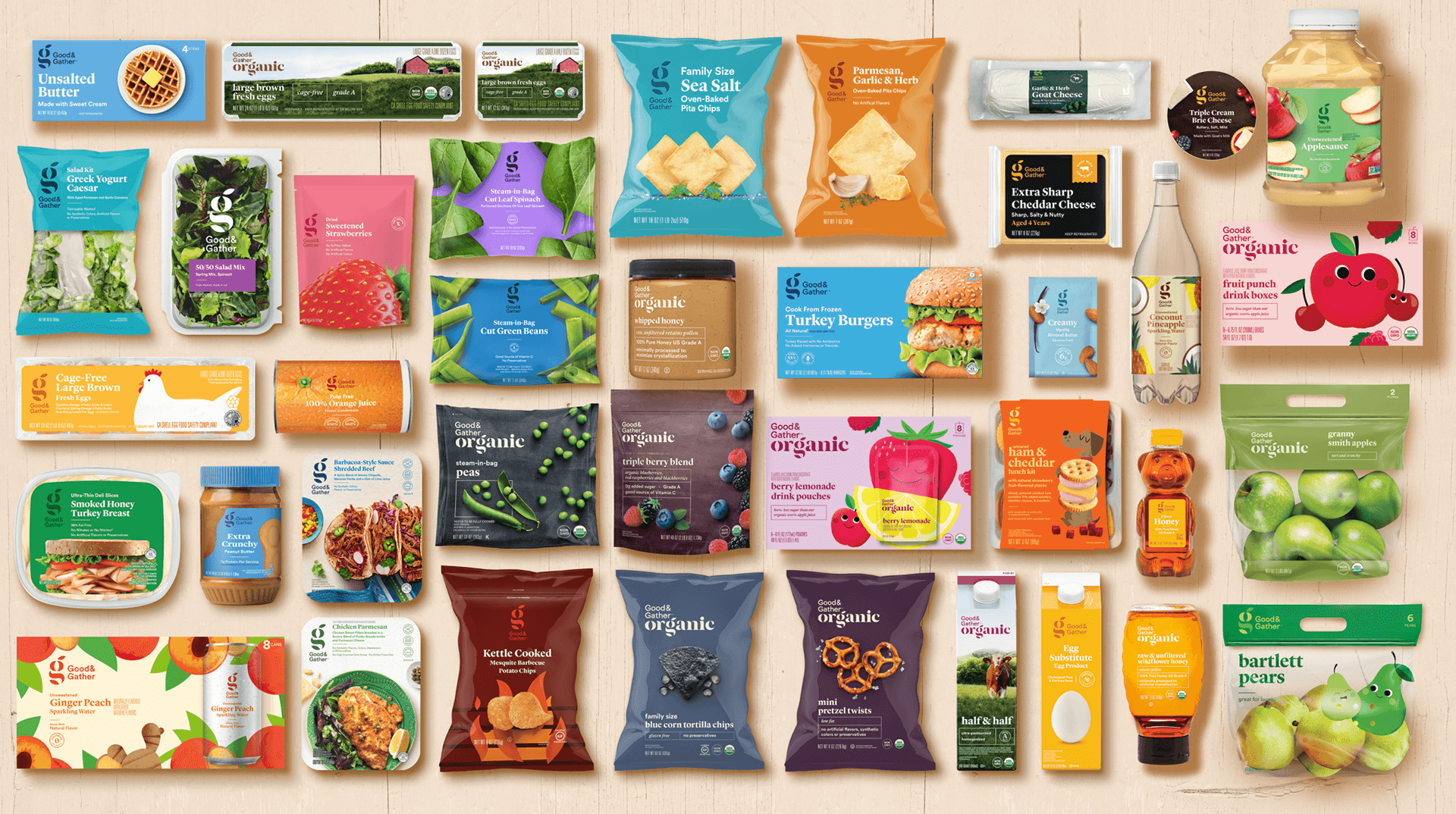
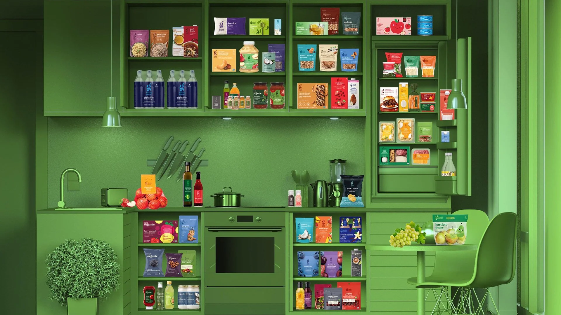
A portfolio design system built to scale– Good & Gather grew to 2,000+ SKUs and surpassed $2 billion in annual sales, becoming Target's largest food owned-brand. Good & Gather was designed as a holistic brand system that could scale across categories, price tiers, and use cases while remaining intuitive and emotionally engaging.
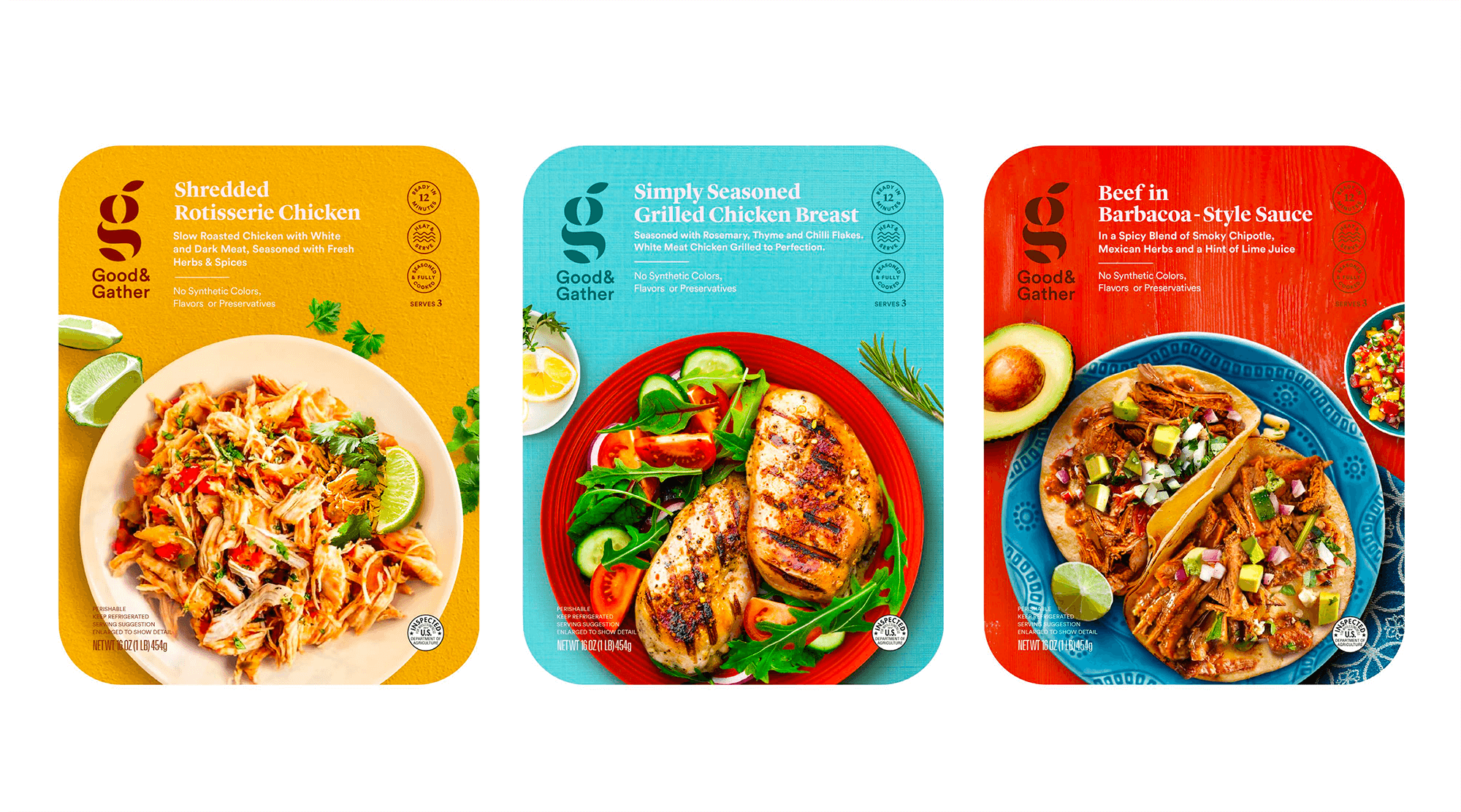
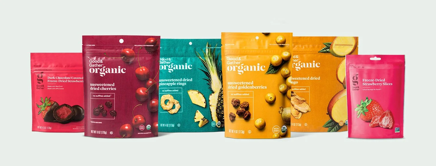
Flavor leads the brand. Packaging architecture prioritizes appetite appeal, ingredient clarity, and craveability, ensuring taste cues are immediate and emotional. Food photography, color, and hierarchy work together to communicate “this will be delicious” before anything else.
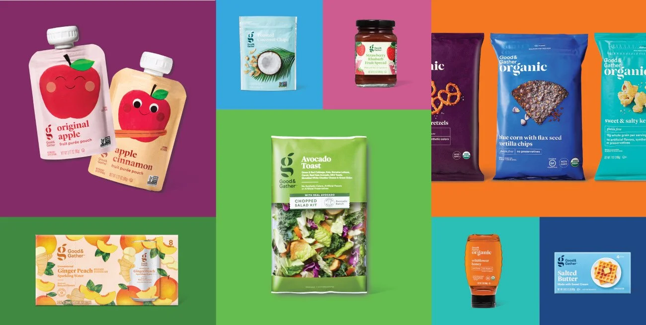
With over 2,000 items across essentials, kids, organic, seasonal, premium, and plant-based offerings, the system was engineered to adapt without losing cohesion. Modular design elements allow the brand to stretch and compress depending on category needs. This creates consistency on shelf while giving each product room to flex within it’s own category context.
Good & Gather balances everyday approachability with quiet aspiration. Clean typography, confident color blocking, and thoughtful composition make the brand feel modern and curated. It elevates private label into something shoppers can trust, enjoy, and feel good about bringing home.
AdWeek, The Dieline, Fast, Company, Eater, Delish, Daily Meal, Business Insider, Today, NBC, USA Today
Featured
Private Label Brand & Packaging Strategy
Packaging Design System
Portfolio Architecture
Visual Identity
Brand World Design
Range Navigation
Color Strategy
SKU Hierarchy
Information Design
Retail Shopability Optimization
In collaboration with Jones Knowles Ritchie

DESIGNING A SYSTEM FOR SCALE, CHOICE AND TRUST
Good & Gather was created as Target’s flagship private label food brand that has a single, cohesive system that could flex across categories, price tiers, and shopper mindsets.
The challenge was not simply to rebrand groceries. It was to design a brand architecture that could operate like a national food company inside a mass retailer, one that was clear, scalable, and intuitive at shelf.
Target shoppers were not looking for more brands. They were looking for clarity. The role of Good & Gather became one of navigation: helping shoppers quickly find the right balance of value, quality, and purpose without forcing trade-offs.
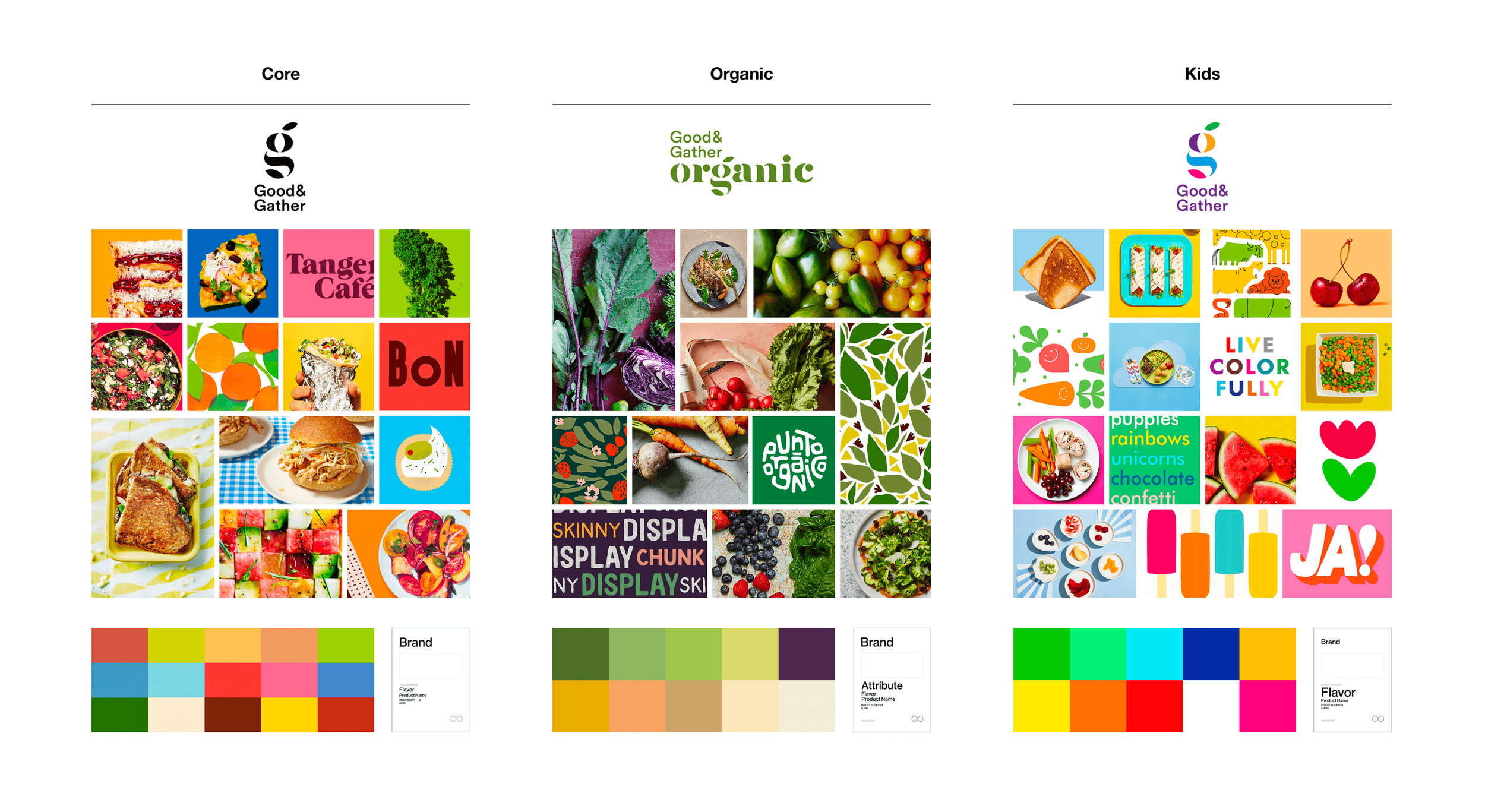
To do that, the brand was architected into clearly segmented tiers, each mapped to a distinct shopper decision mode and use occasion, while still feeling unmistakably part of the same family.


CORE
The Core tier anchors the system. It is approachable, colorful, and abundance-driven, designed to feel modern, optimistic, and broadly appealing across hundreds of SKUs.
Strategically, Core does the heavy lifting:
Signals value without feeling generic
Creates visual consistency across a massive assortment
Competes directly with national brands while feeling more curated
The design language leans into bold color, joyful food photography, and confident simplicity, making everyday staples feel elevated but accessible.

ORGANIC
The Organic tier was intentionally differentiated without fragmenting the brand. This tier is designed for shoppers who:
Are label readers and ingredient conscious
Want organic credentials without boutique pricing
Expect restraint, credibility, and trust
Muted earth tones and editorial photography create a calmer, more considered shelf presence, helping shoppers instantly understand why this product sits at a different price and value tier.


ELEVATED BY INTENTION
Good & Gather Signature represents the most refined expression of the brand. It was designed to compete in the ultra-premium tier, where taste, sourcing, and craft are assumed and differentiation comes from restraint.
Visually, the system shifts to black-forward packaging with minimal color, sophisticated typography, and deliberate composition. This reduction is strategic. It creates contrast within the aisle, signals confidence, and elevates the product.
Signature is for shoppers seeking a sense of discovery and indulgence within a trusted retail environment. It allows Target to credibly participate in premium and specialty categories while keeping the reassurance of the Good & Gather name.
At a system level, Signature extends the brand upward without fragmenting it. It reinforces that Good & Gather is not defined by a single price point or aesthetic, but by a flexible framework capable of moving seamlessly from everyday to exceptional.

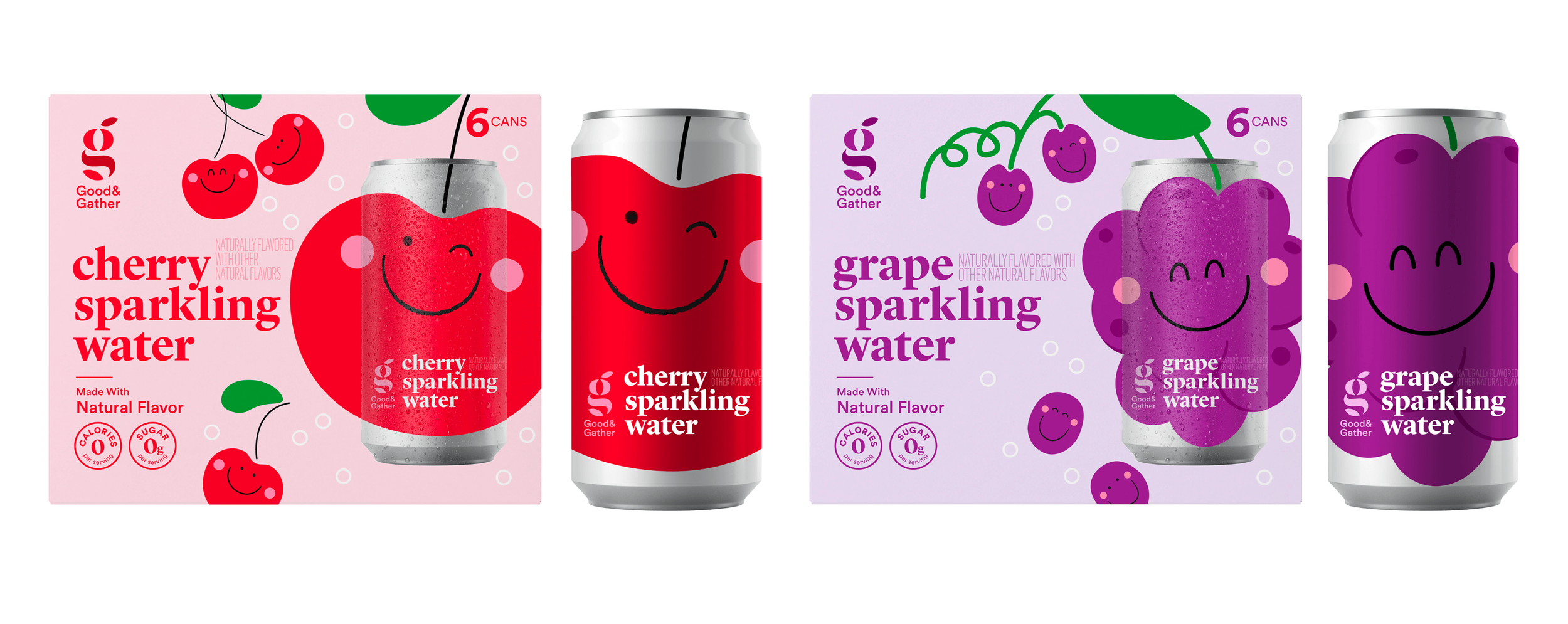
DESIGNED FOR DELIGHT
The Kids tier addresses a different decision tree entirely, one where parents and children are co-shoppers.
The strategy here was not to simplify the brand, but to translate it. Bright, expressive color, friendly illustration, and character moments create energy and appeal.
Importantly, Kids still feels like Good & Gather, reinforcing trust with parents while earning attention from kids.
Scaling Complex Brand Portfolios