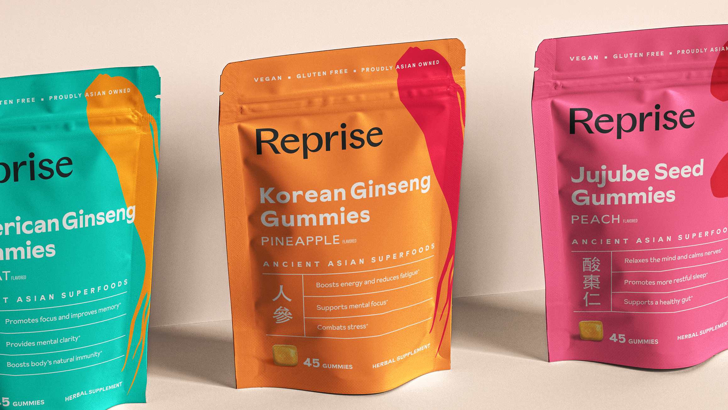
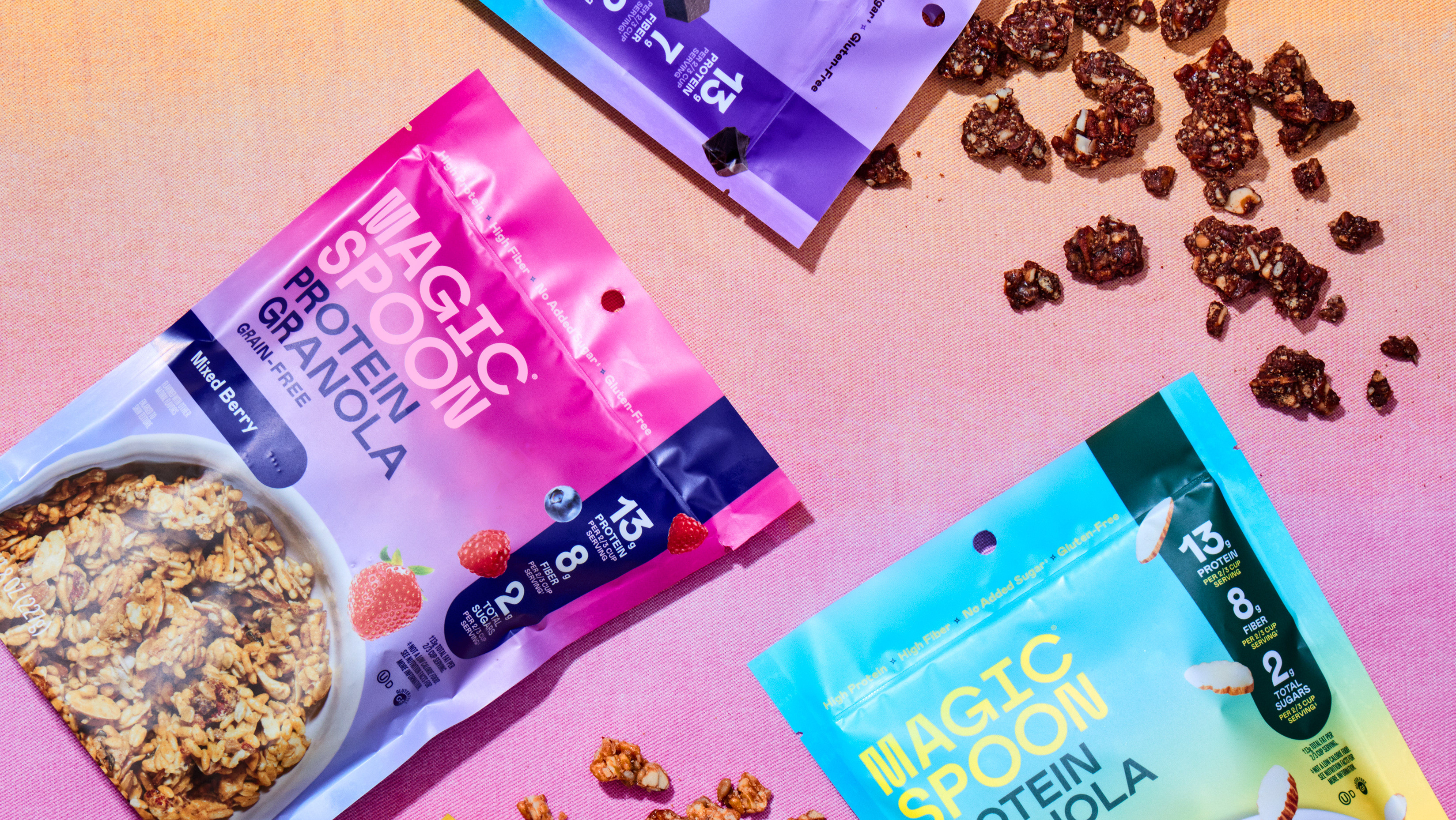
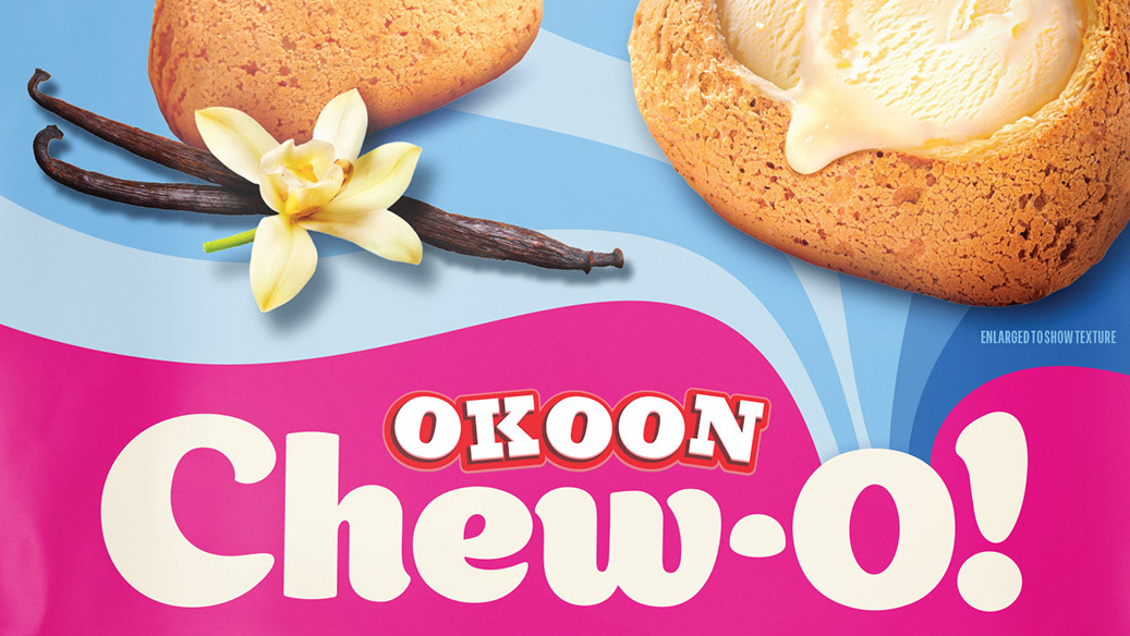
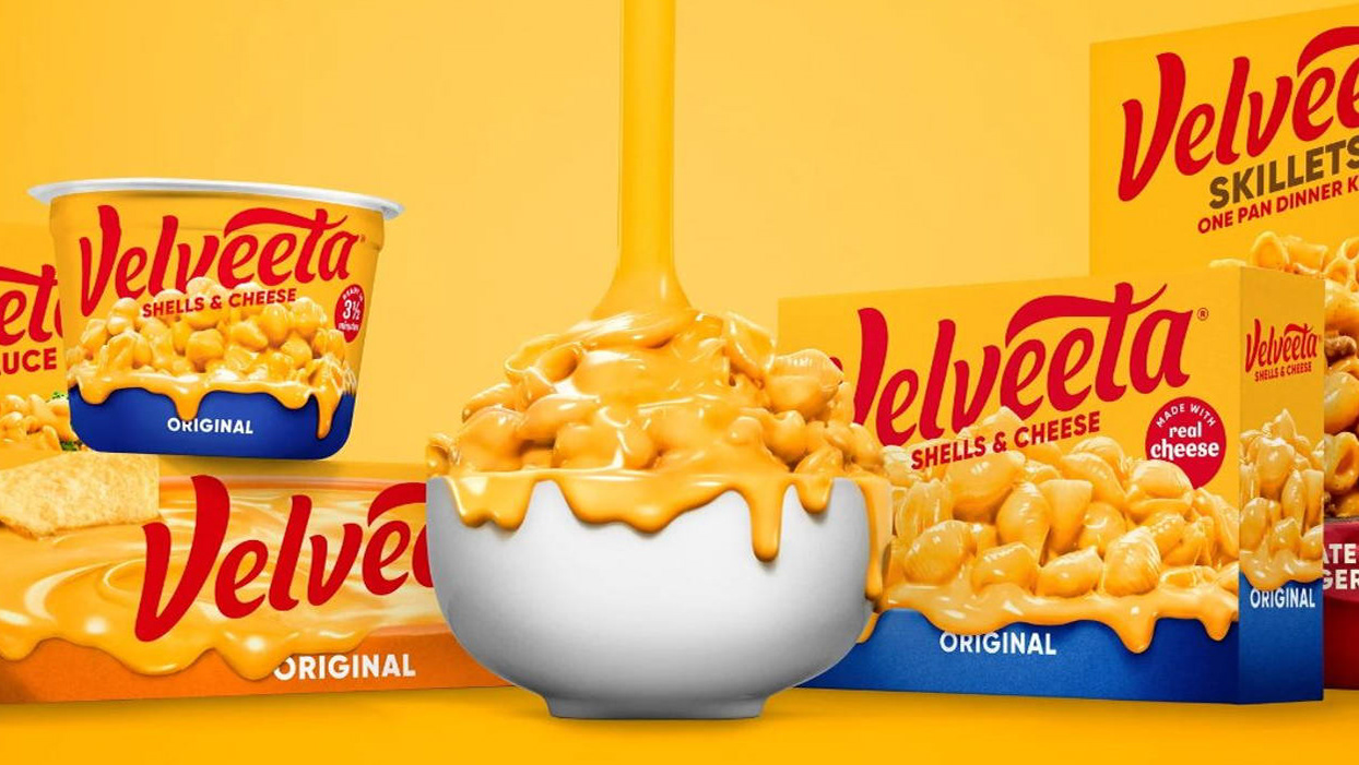
CREATIVE CHALLENGE
Transform the packaging of 505 Hatch Magic Chips into a visually striking and premium design that honors the brand’s Southwestern roots while standing out in a competitive snack aisle. The existing design lacked the vibrancy and modern appeal needed to captivate today’s adventurous snackers. Competing in the ever-growing snack market meant the redesign needed to capture attention, evoke craveability, and reinforce 505’s reputation for premium Hatch chile-based products—all while maintaining brand recognition.
SOLUTION
We crafted a bold, dynamic visual identity that amplifies the brand’s signature Hatch chile flavors. Rich, earthy color palettes, contemporary typography, and flavor packed product photography bring the essence of the Southwest to life. The refreshed packaging not only enhances shelf presence but also reinforces 505’s heritage, making every bag an irresistible pick!
CLIENT TESTIMONIAL
Anna is an outstanding designer with a wealth of experience under her belt with a proven track record of delivering high quality work. She is capable of managing multiple projects simultaneously, is responsive to feedback and is capable of quickly pivoting to accommodate a change in scope or direction. Highly recommend.
- Lee Nelson, Head of Marketing at Insignia International
- Lee Nelson, Head of Marketing at Insignia International
