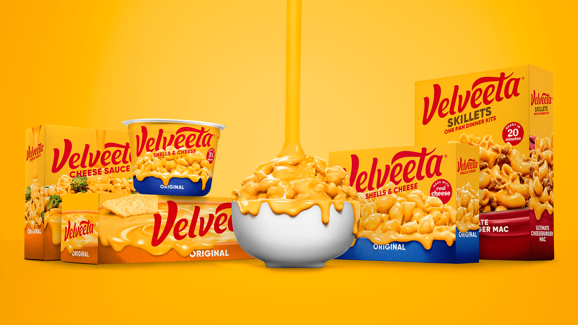
Velveeta
Reimagine one of the most recognizable brands in the cheese aisle for today’s consumer– without losing the boldness, comfort, and confidence that made it iconic.
The opportunity was not to sanitize Velveeta, but to amplify what makes it unmistakable: its unapologetic cheesiness, cultural relevance, and swagger. The redesign needed to feel modern and expressive, while preserving the visual cues generations of shoppers already trust.
Market Opportunity
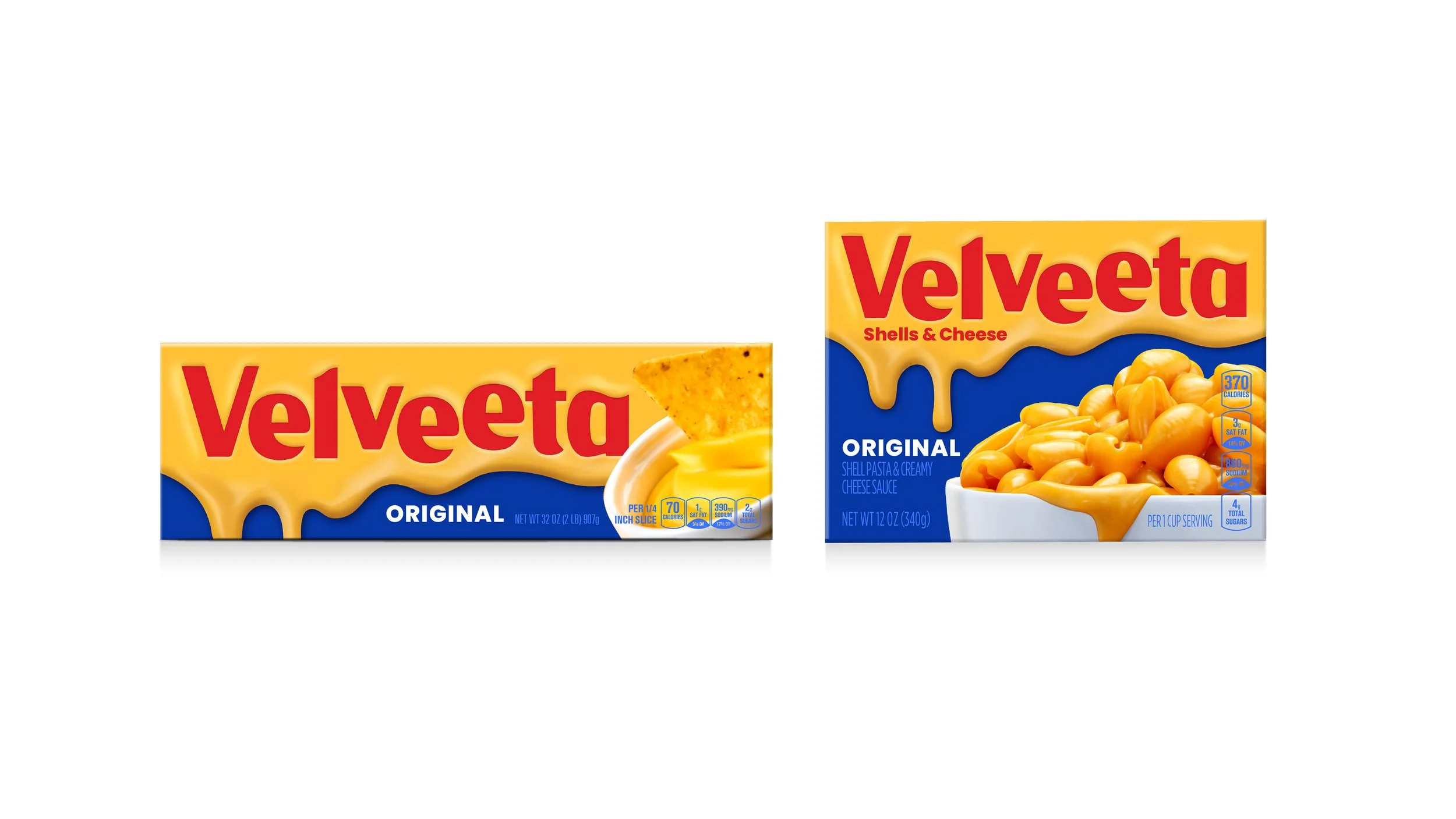
First redesign in 20 years– covered by AdAge, Adweek, and Dieline. The rebrand was recognized at AdAge's 2022 Creativity Awards for driving measurable sales growth., putting Velveeta in the spotlight as supremely creamy and relentlessly original.
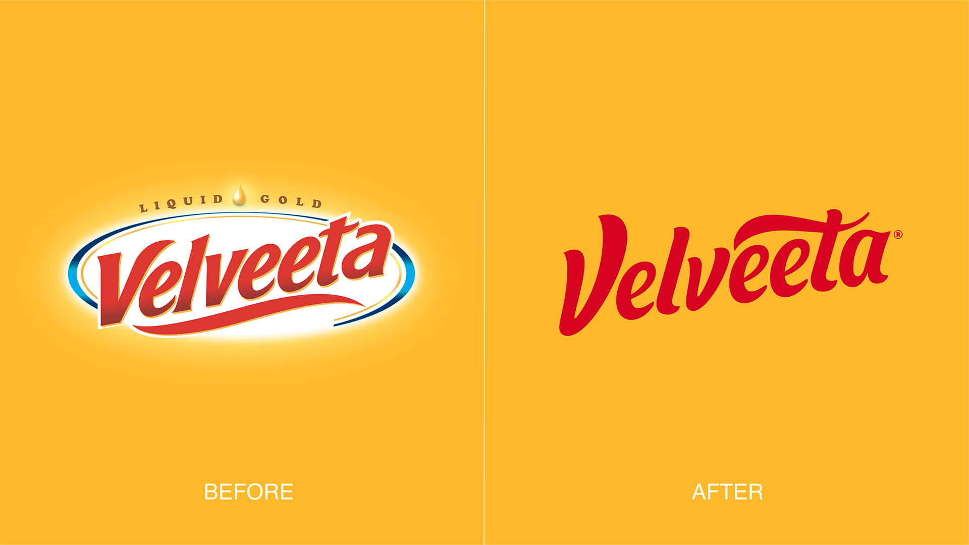
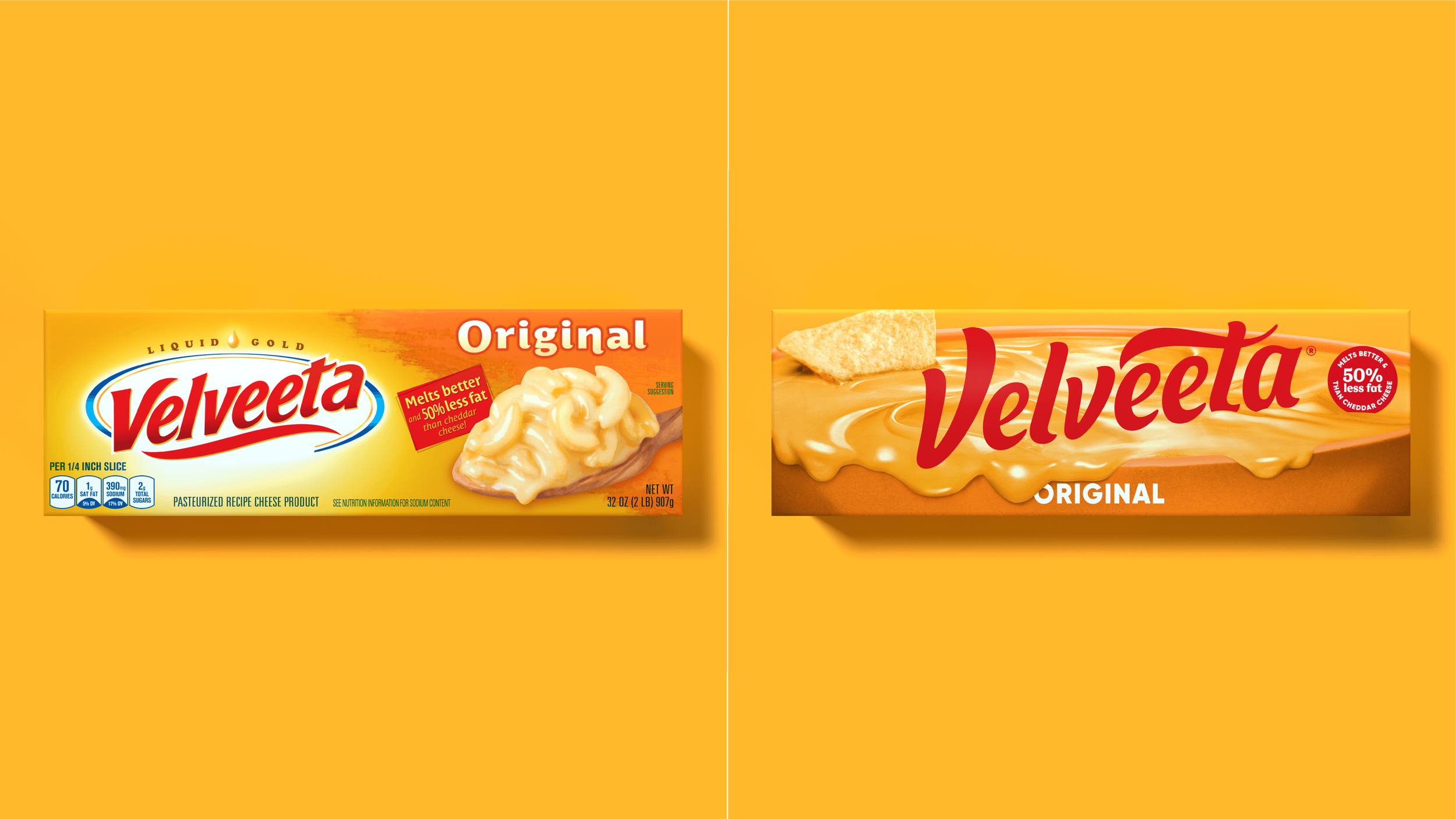
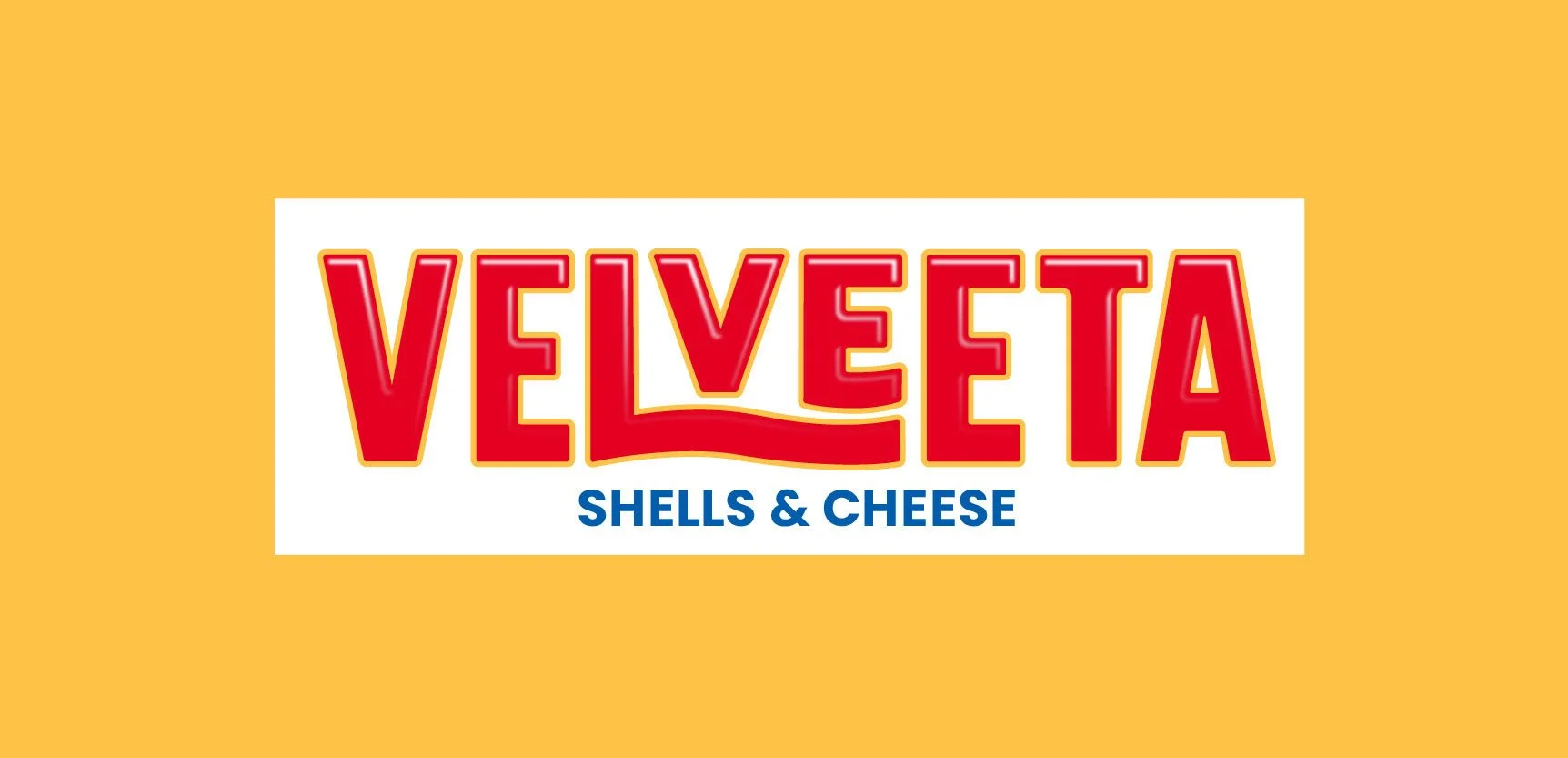
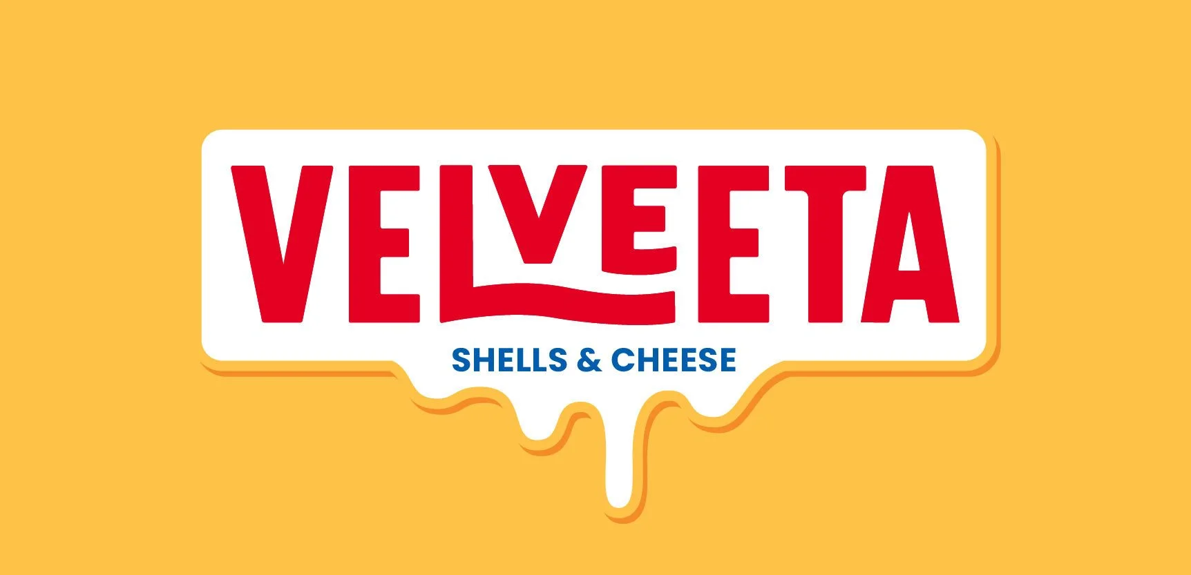
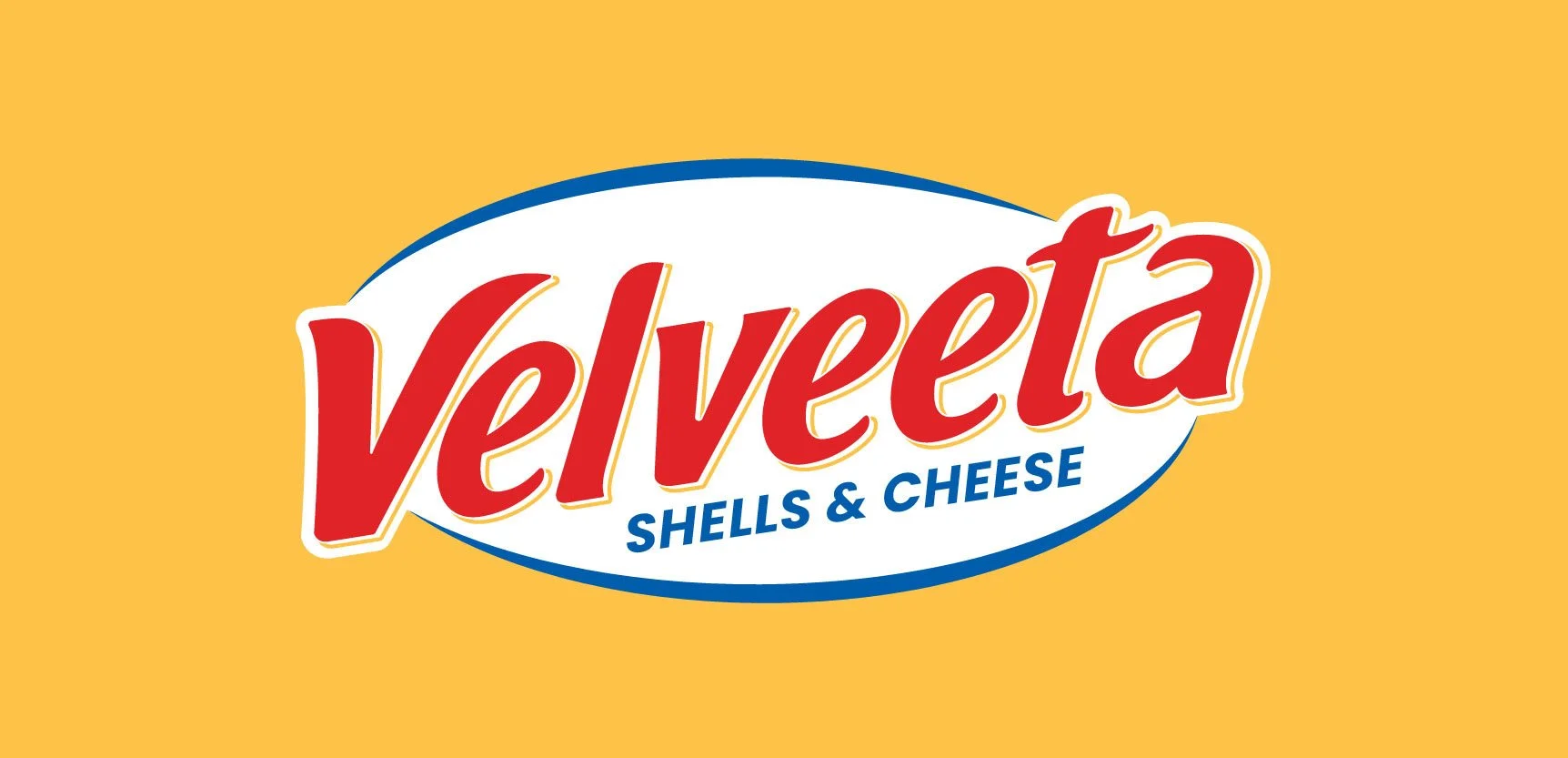
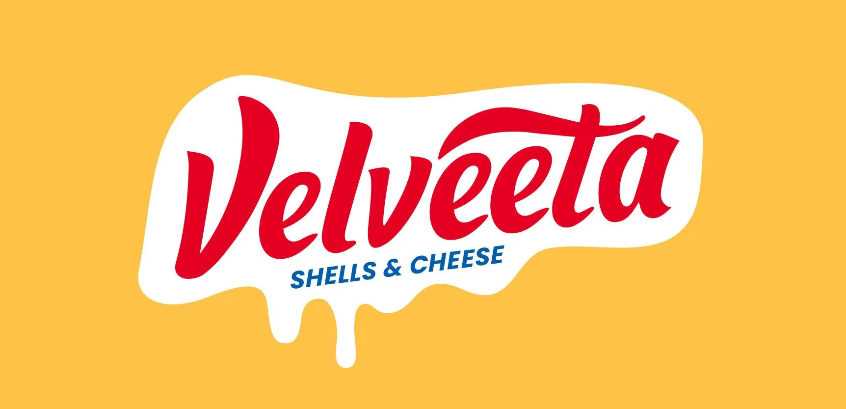
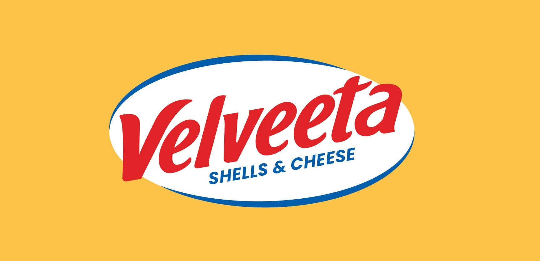
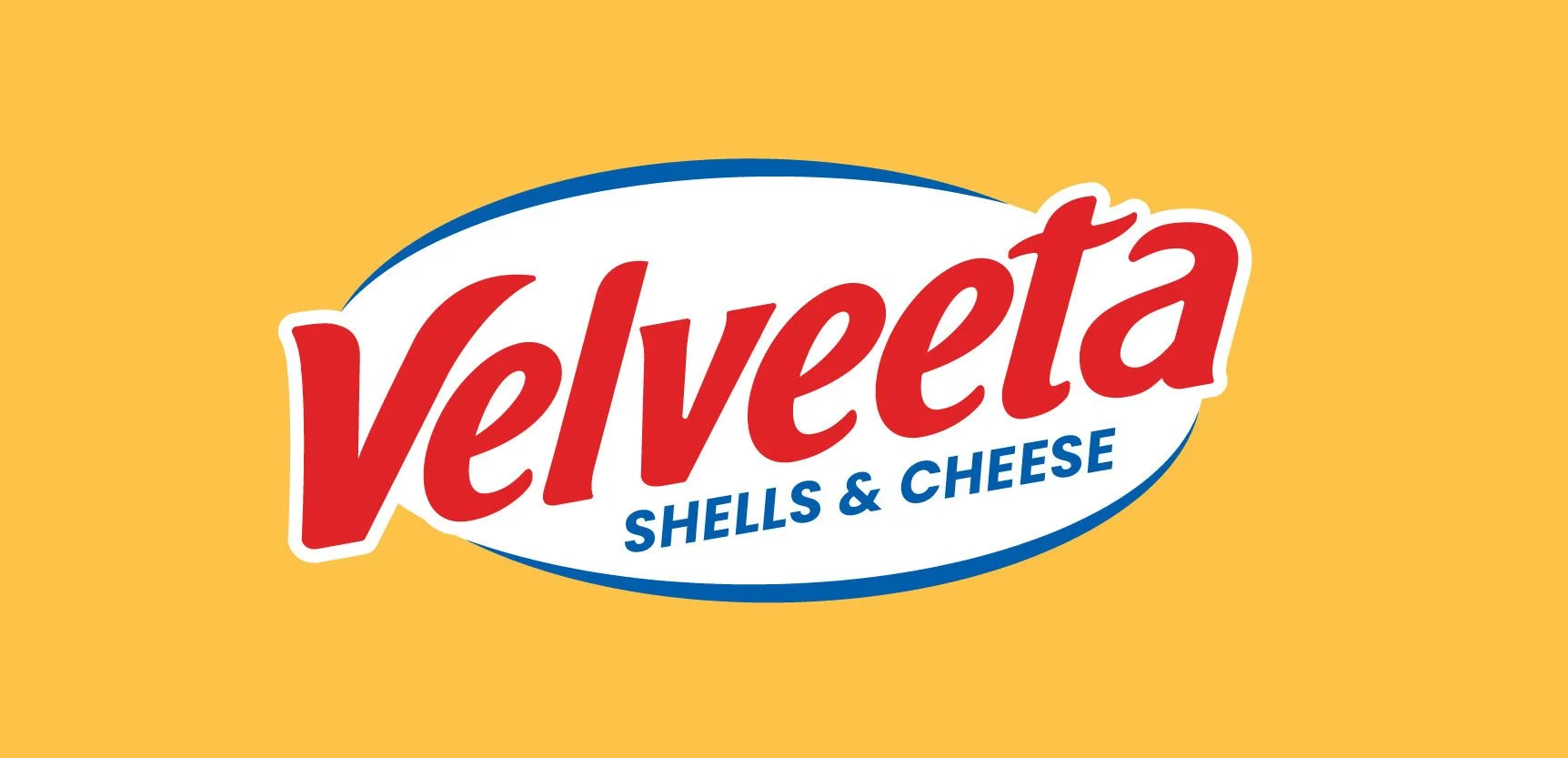
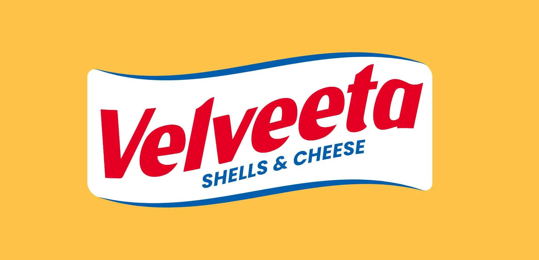
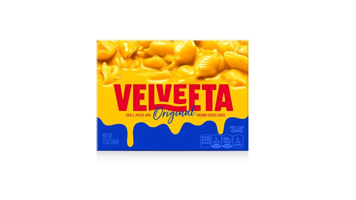
The logo was reimagined as an evolution, not a departure. We introduced softer, more fluid curves inspired by the product itself, subtly weaving the language of cheese into the letterforms. Key structural elements – such as the iconic angle and underline – were kept to protect recognition, with the underline reinterpreted as the crossbar of the “T” for a more integrated, contemporary expression. The logo feels new, but instantly Velveeta.
Outcome
Press
Brand Renovation
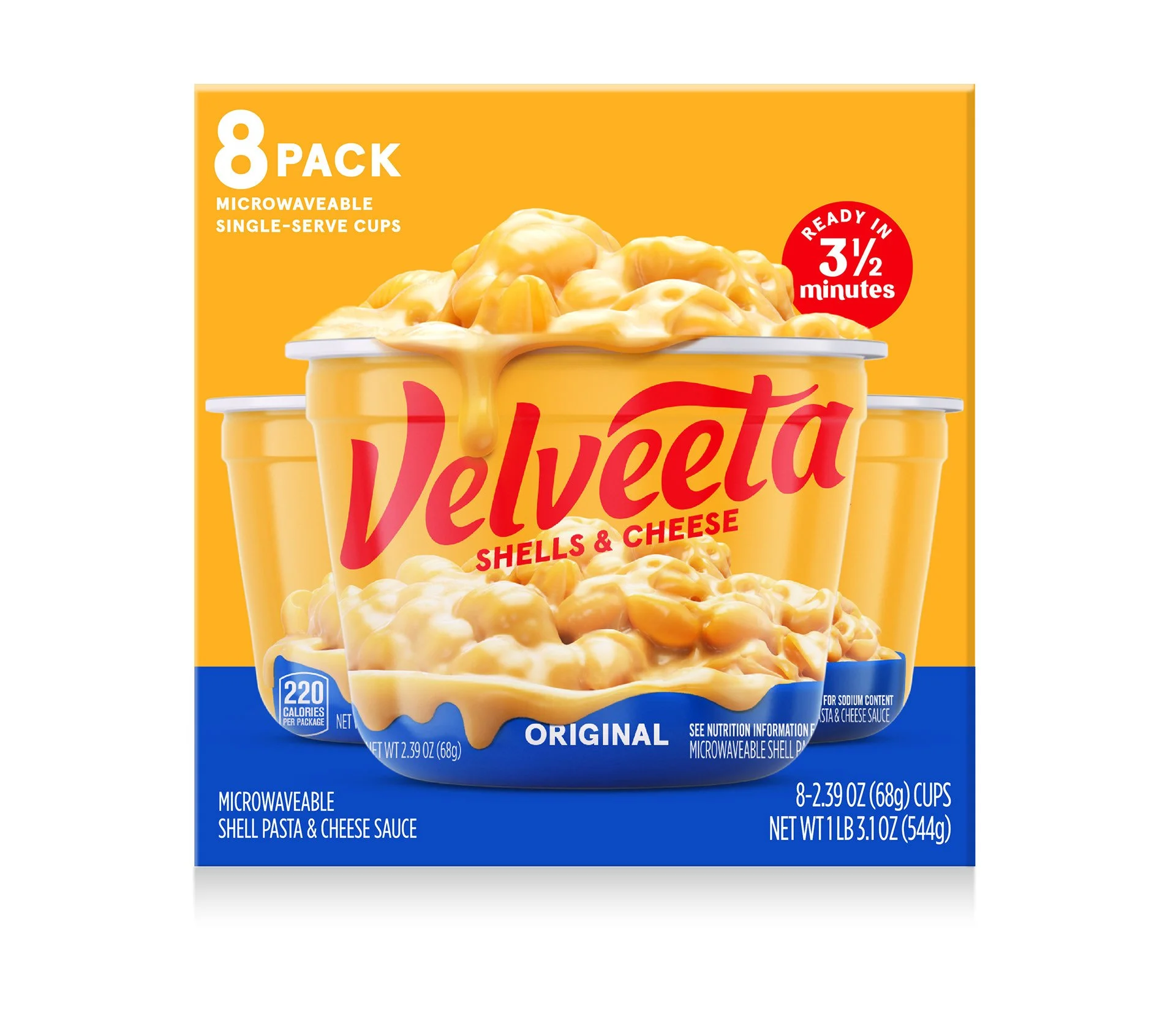
Packaging Design
Visual Identity
Brand World Design
Logo & Typeface Design
Portfolio Architecture
Range Navigation Strategy
Shoppability Optimization
In collaboration with Jones Knowles Ritchie
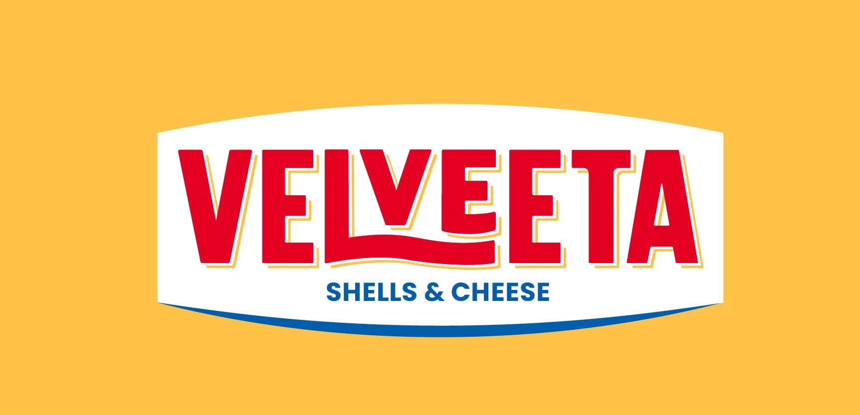
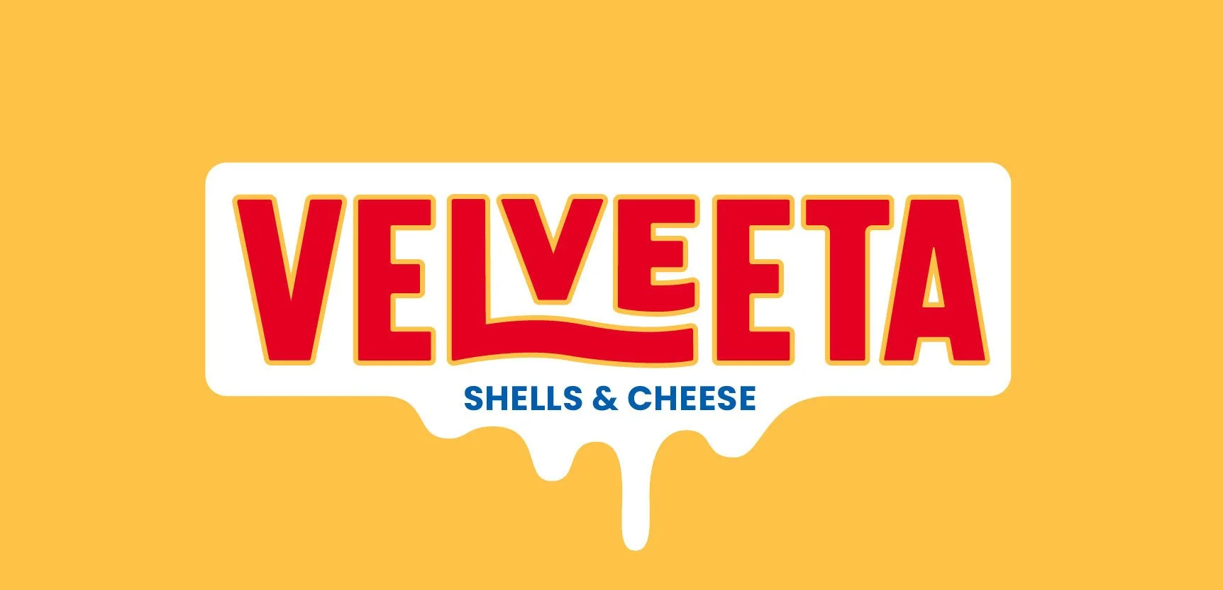
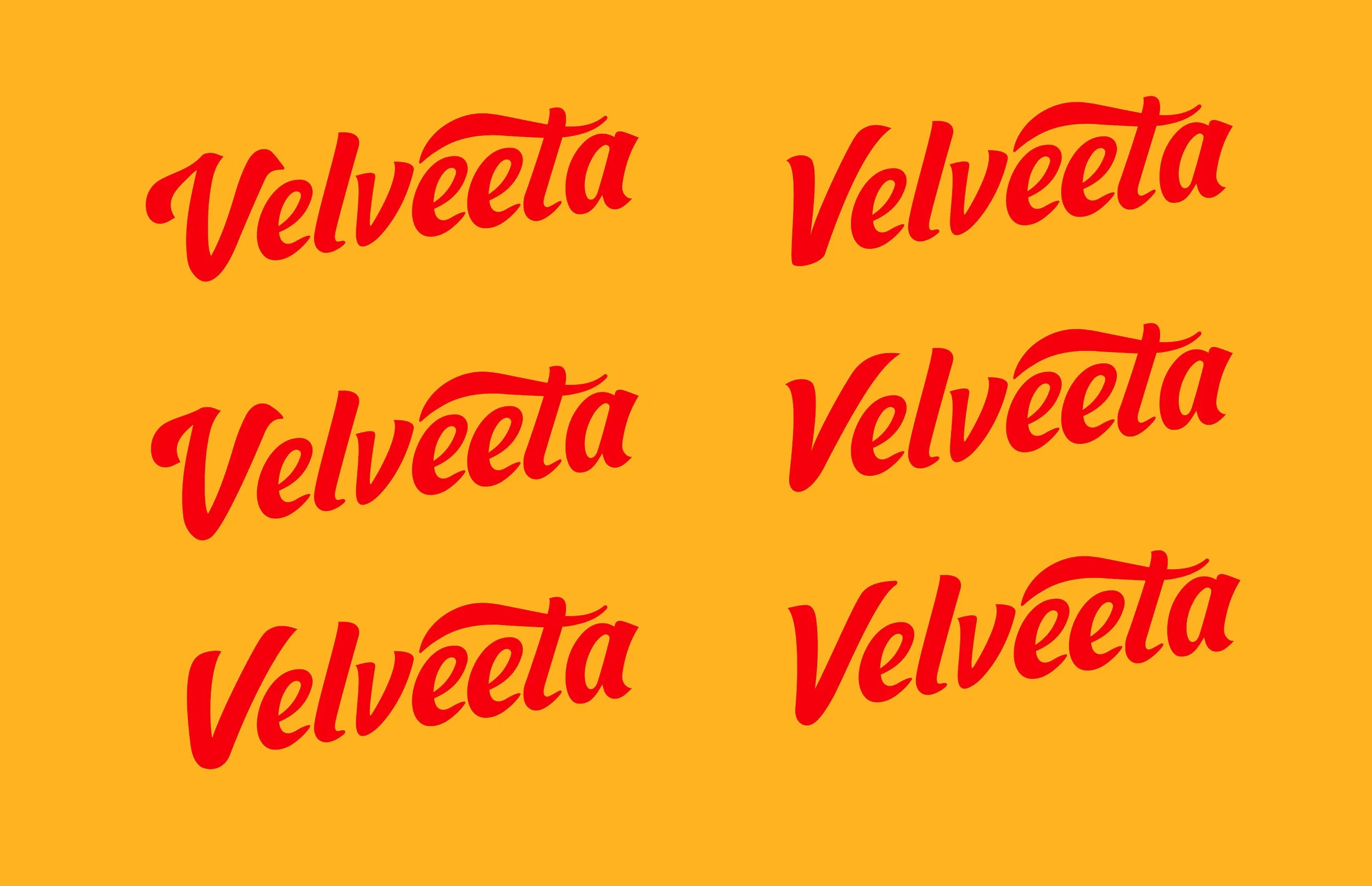
LOGO REFRESH
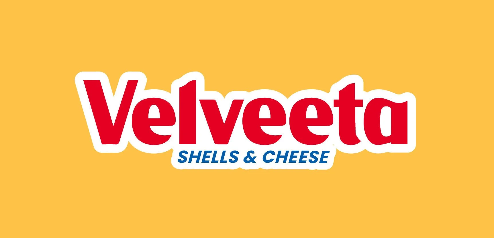
The evolution of Velveeta’s visual identity represents a confident step toward modern simplicity, trading the busy ornaments of the past for a more soulful, expressive wordmark.
The new logo allows the typography to carry the brand's personality through a fluid script that feels as smooth and creamy as the product itself. This transition isn't just about cleaning up the aesthetic; it’s about unlocking a heritage brand’s potential to feel both iconic and approachable in a modern landscape.
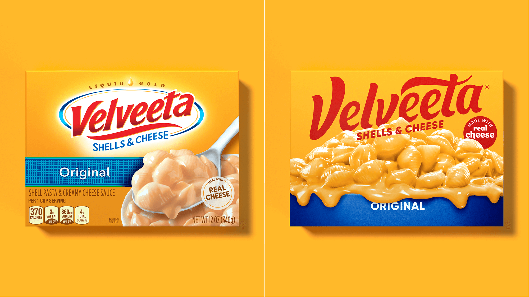
BEFORE VS. AFTER
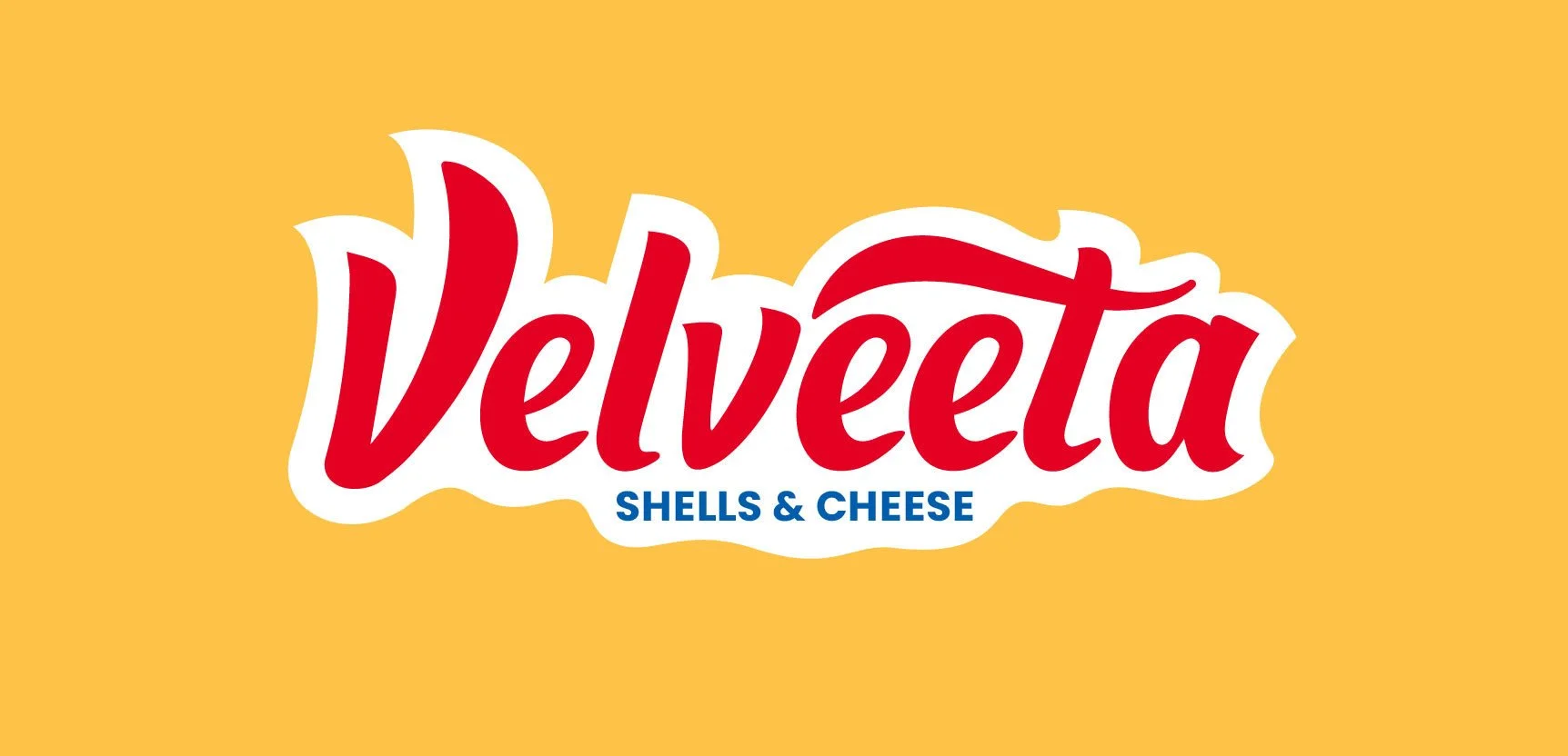
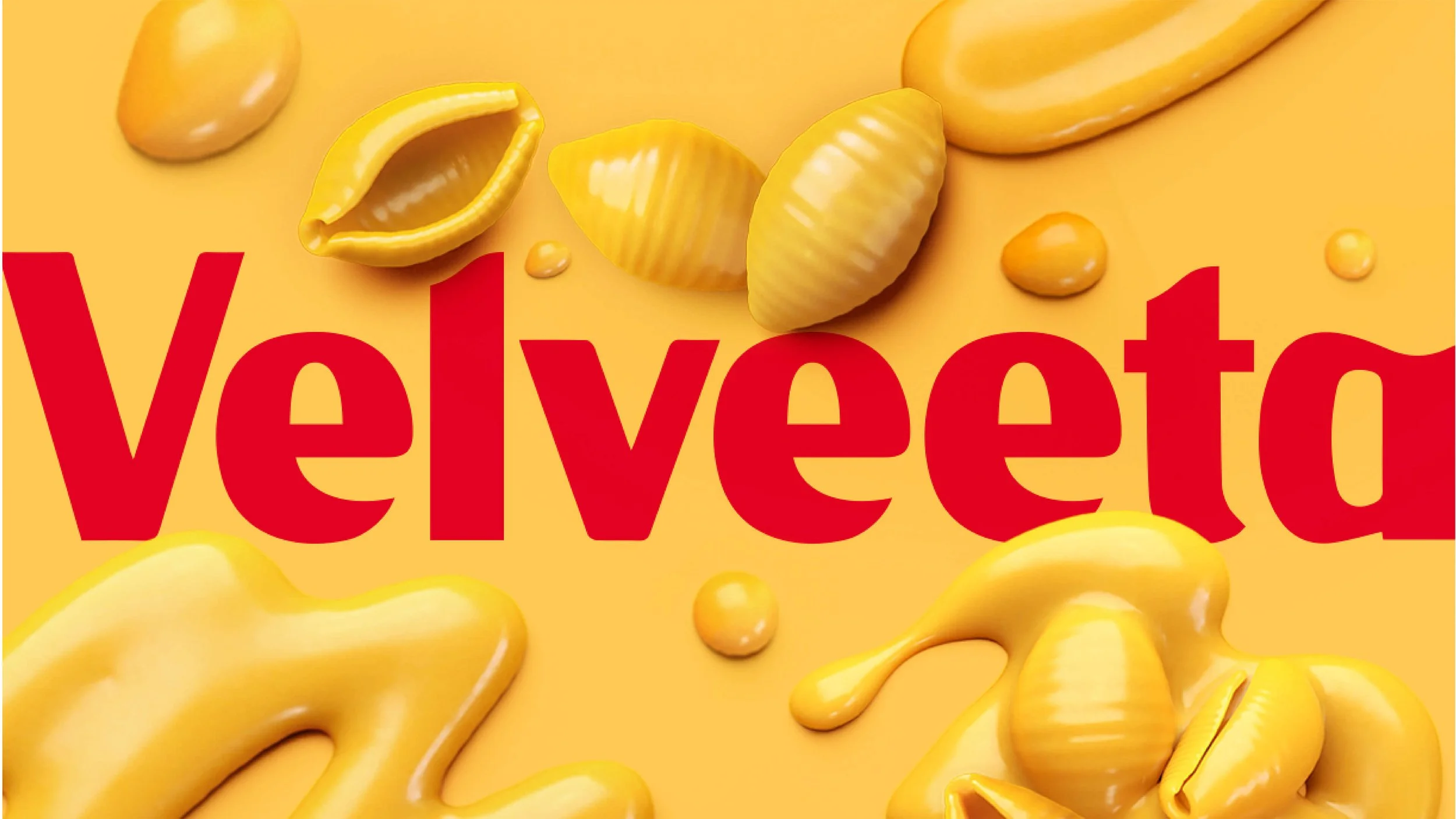
CUSTOM TYPEFACE
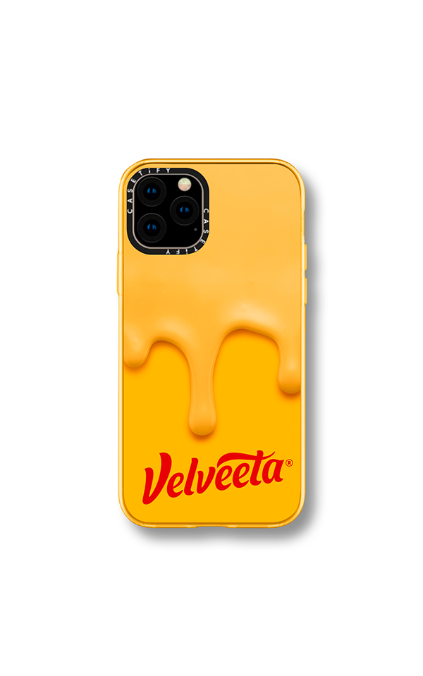
In collaboration with F37, we had the unique opportunity to create a custom typeface that perfectly represented the brand. The melted curves and playful letterforms perfectly capture the irresistibly smooth texture of the cheese, adding a whole new dimension to the brand's personality! The typeface was aptly named DRIPPIN BOLD


DISTINCTIVE BRAND ASSETS
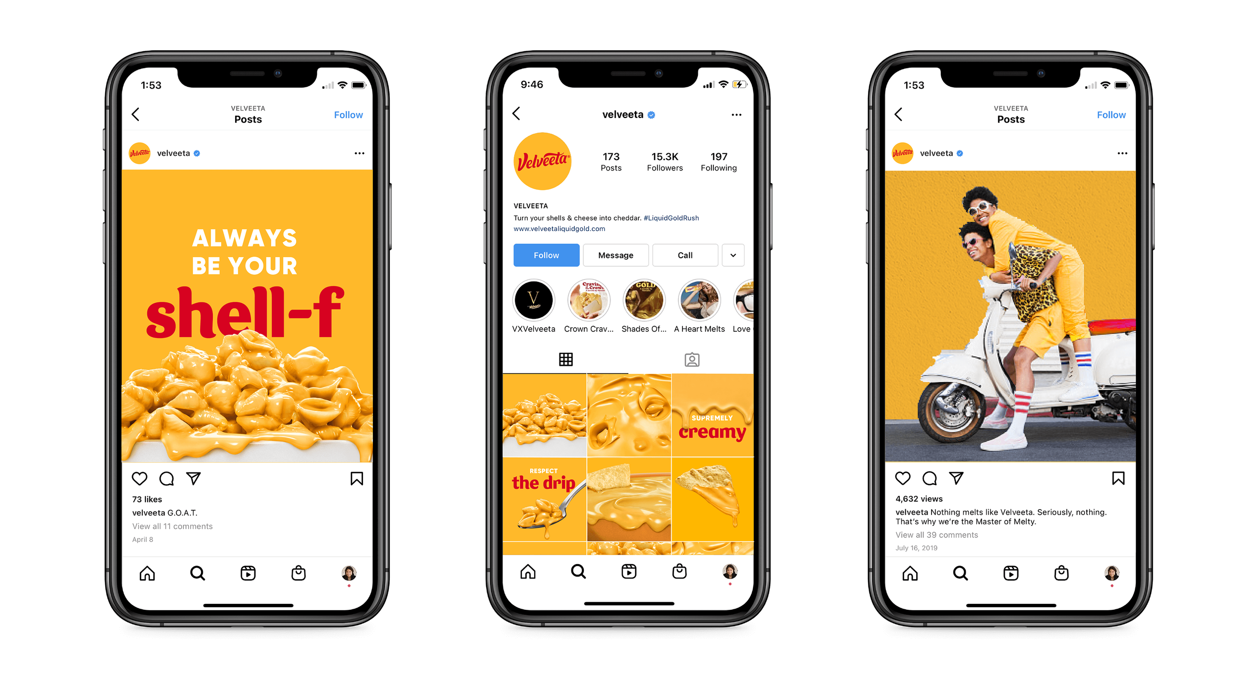
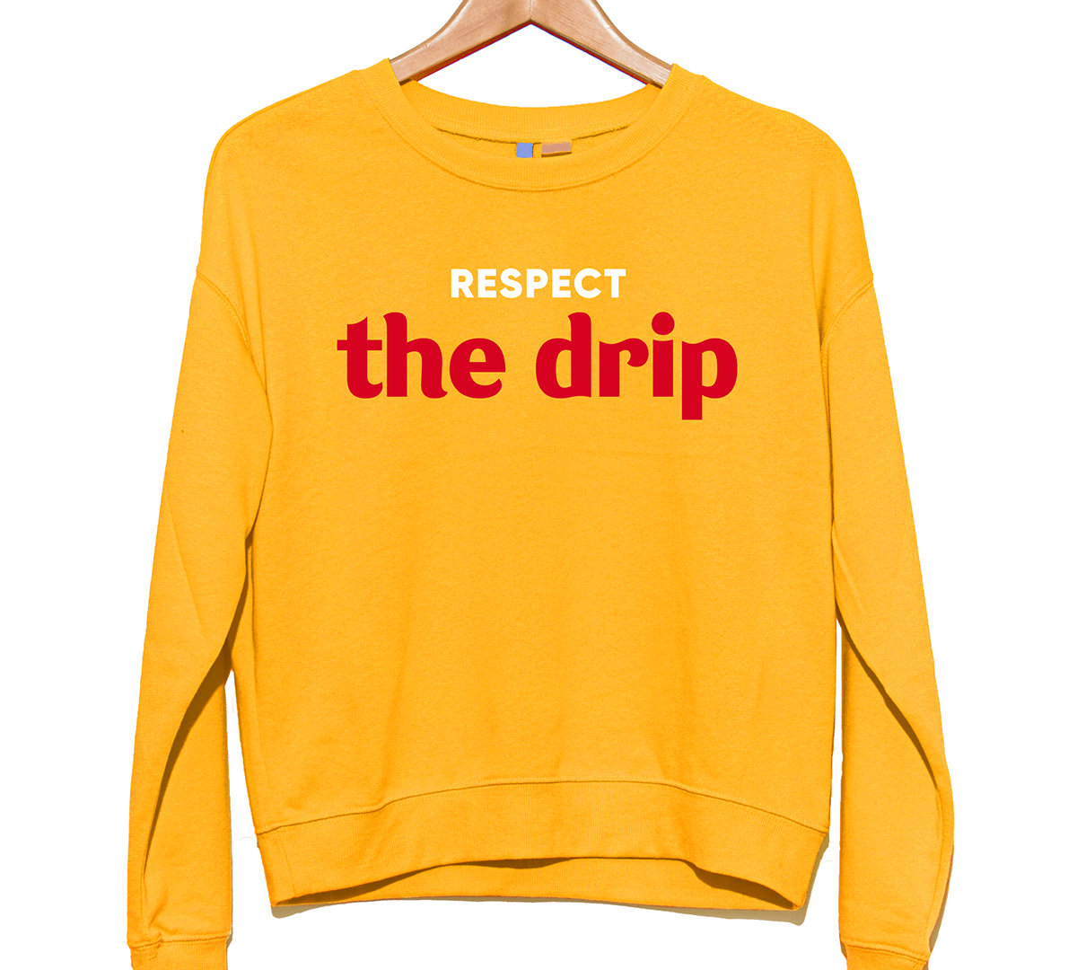
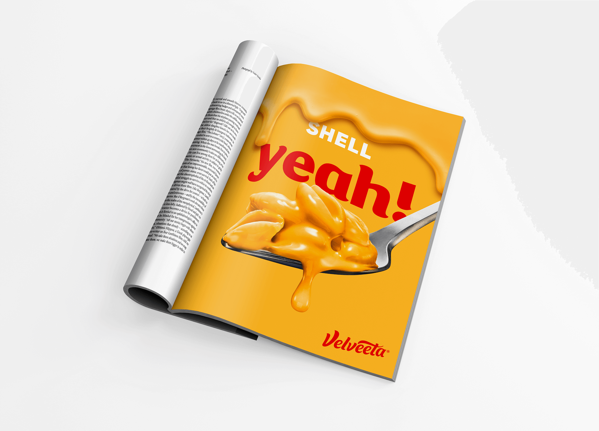
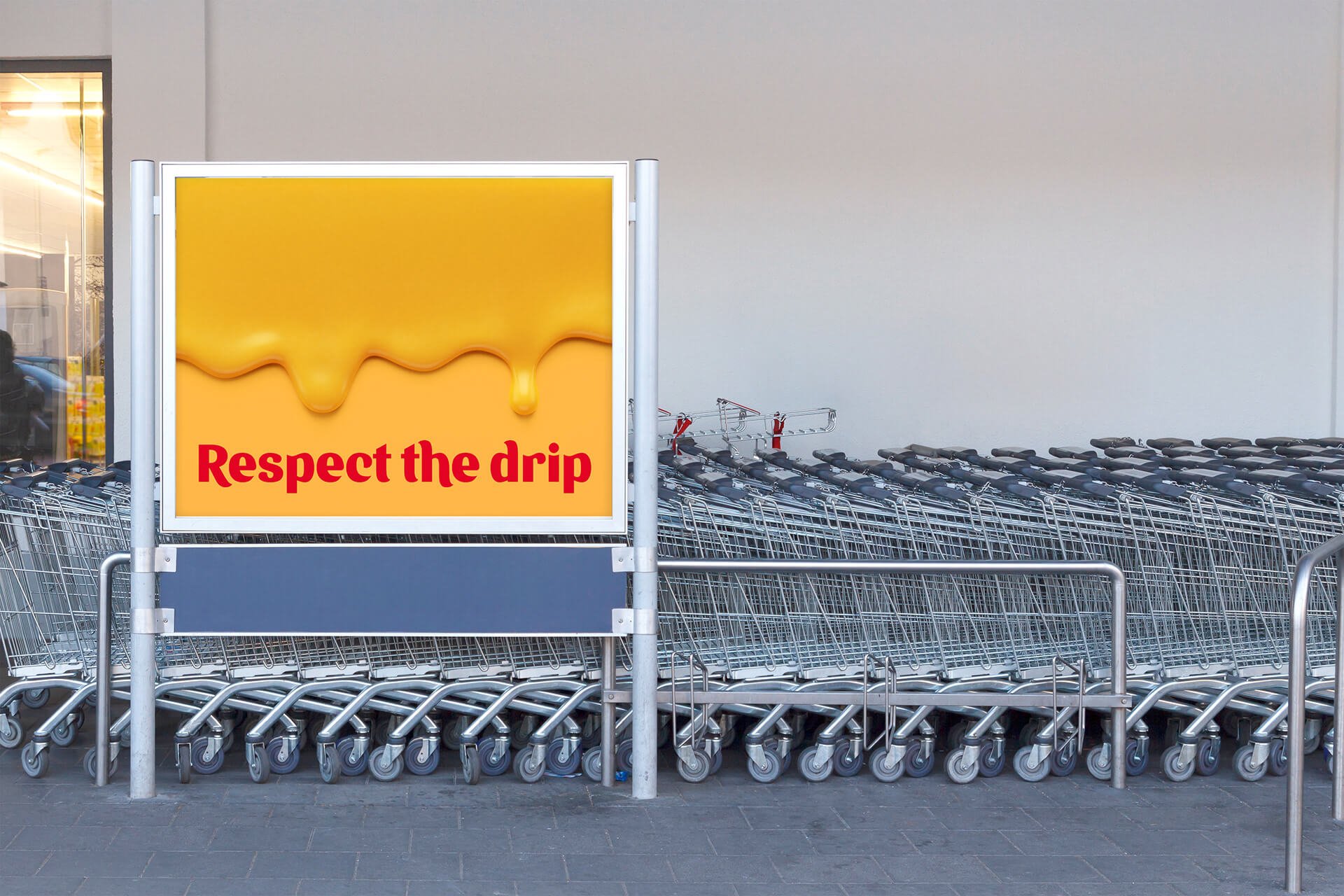
Velveeta’s new DBAs weren’t designed to live quietly on pack. They were built to activate a world. One that feels unmistakably Velveeta wherever it shows up.
Each DBA functions as a flexible expression of the brand, giving Velveeta permission to show up louder, bolder, and more playful without losing coherence. Together, they form a system that translates the brand’s core promise: unapologetically creamy.
In the brand world, the distinctive brand assets drive:
High-impact color blocking that turns Velveeta gold into a recognizable backdrop, not just a brand color
Confident, irreverent headlines that lean into humor, indulgence, and self-expression
Tactile food moments: drips and pours that dramatize creaminess as a visual asset
Lifestyle imagery with attitude, where the brand shows up as a personality, not a product
By extending the brand assets beyond packaging and into the broader brand ecosystem, Velveeta moves from being a product you recognize to a brand you experience.
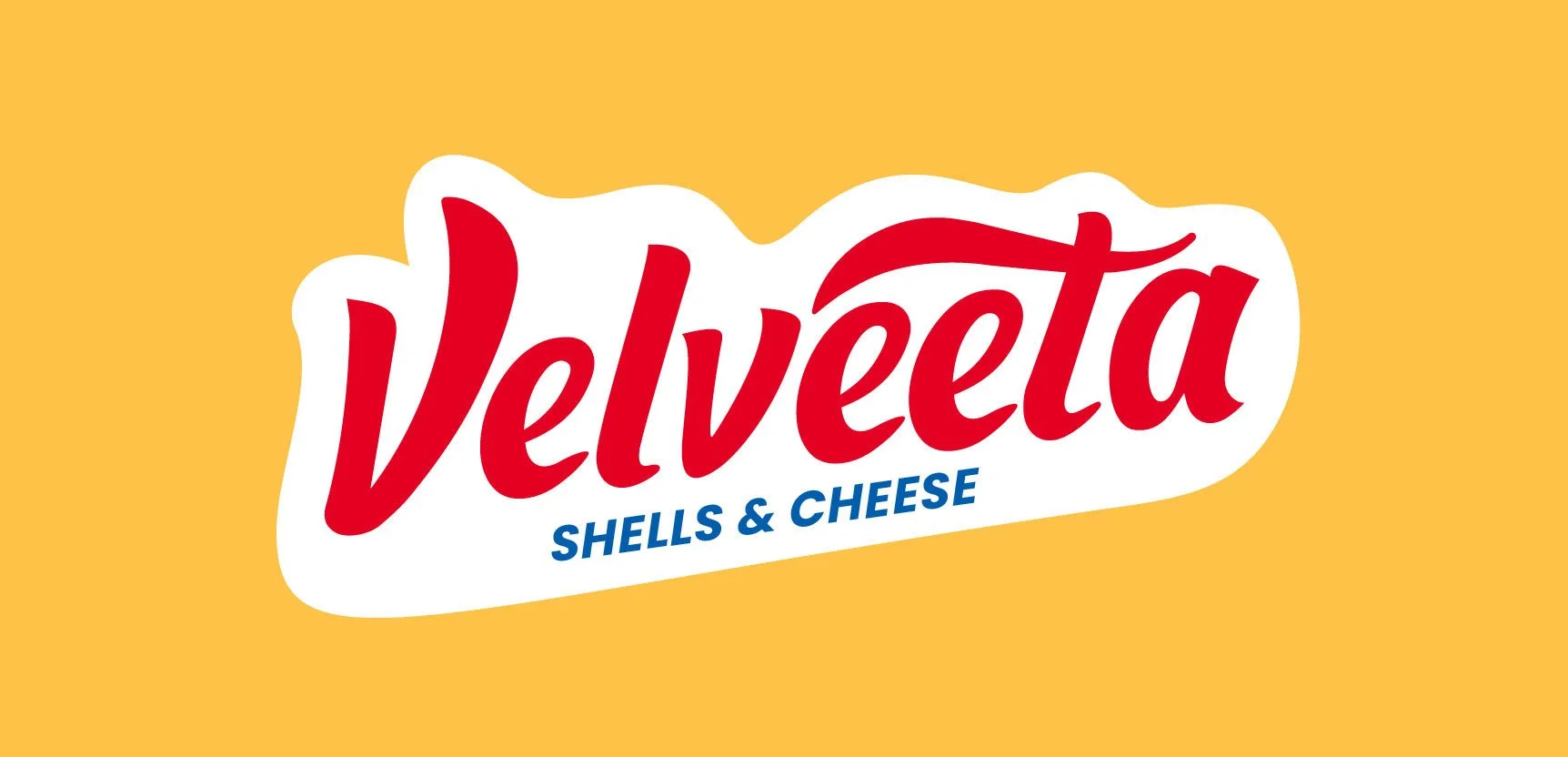
WORDMARK EXPLORE
Beyond the final wordmark, the exploration phase was about finding the perfect balance between Velveeta’s rich heritage and a modern interpretation. We pushed the boundaries of the iconic script, experimenting with various weights, "drip" intensities, and container shapes to see how far the brand’s visual elasticity could stretch.


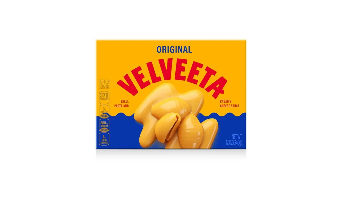
PACKAGING DESIGN EXPLORE
The packaging exploration was an opportunity to lean into the brand’s most visceral assets: its unapologetic gold color asset and the iconic drip. We experimented with varying levels of graphic abstraction, testing how a bold, blocky typeface might play against the soft curves of the shell pasta, and how much "ooze" was needed to trigger that immediate appetite appeal.
By playing with scale and color blocking, we explored a system that feels less like a grocery staple and more like a modern lifestyle brand, ensuring that whether the look is retro or ultra-modern, the creamy, indulgent essence of the product remains the undisputed hero of the shelf.


More Legacy Brand Modernization