In collaboration with Pearlfisher
CREATIVE CHALLENGE
Colgate set out to create a new electric toothbrush brand that gets millenial manual users to trade up by decluttering and breaking complicated category norms.
SOLUTION
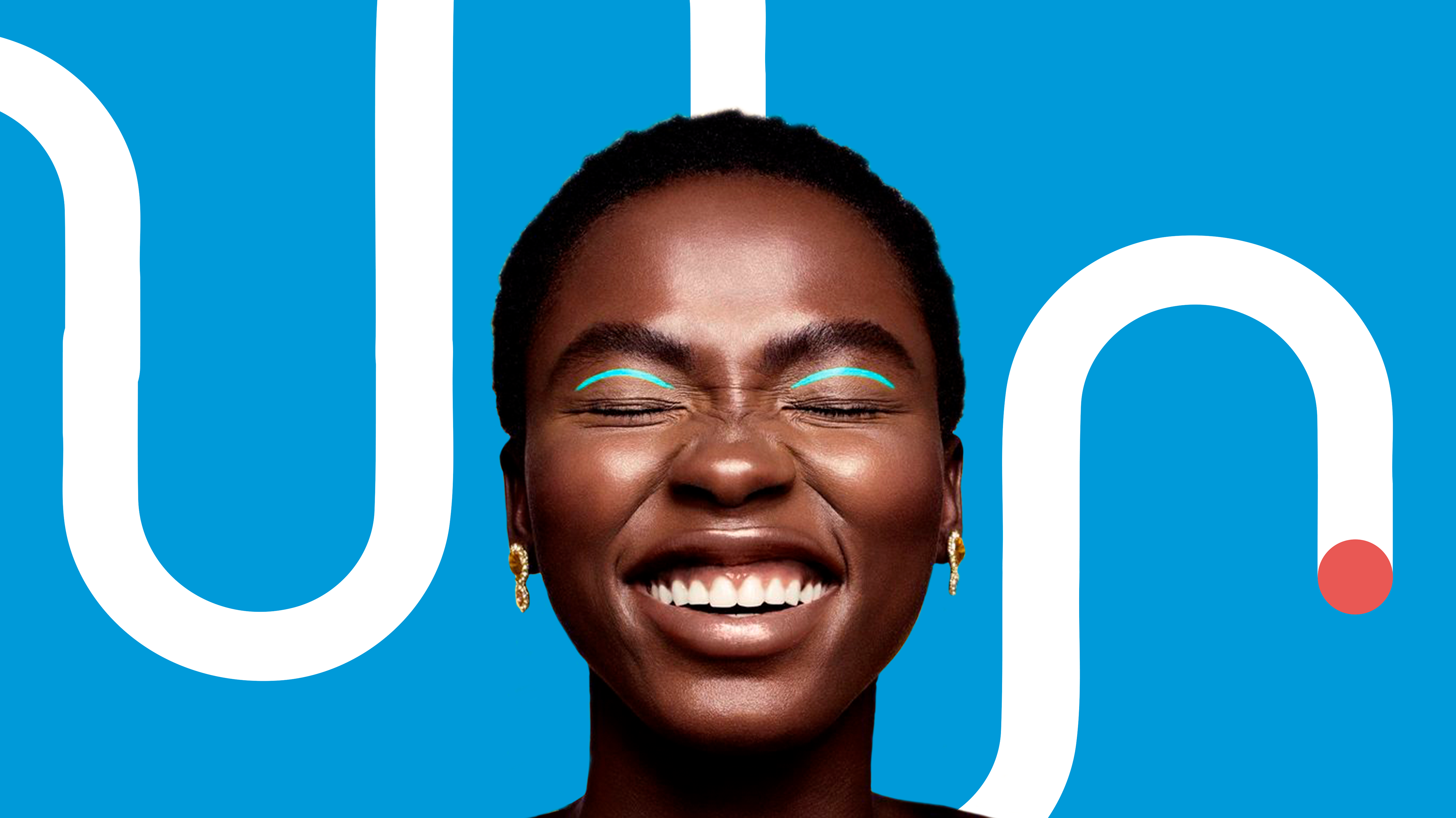
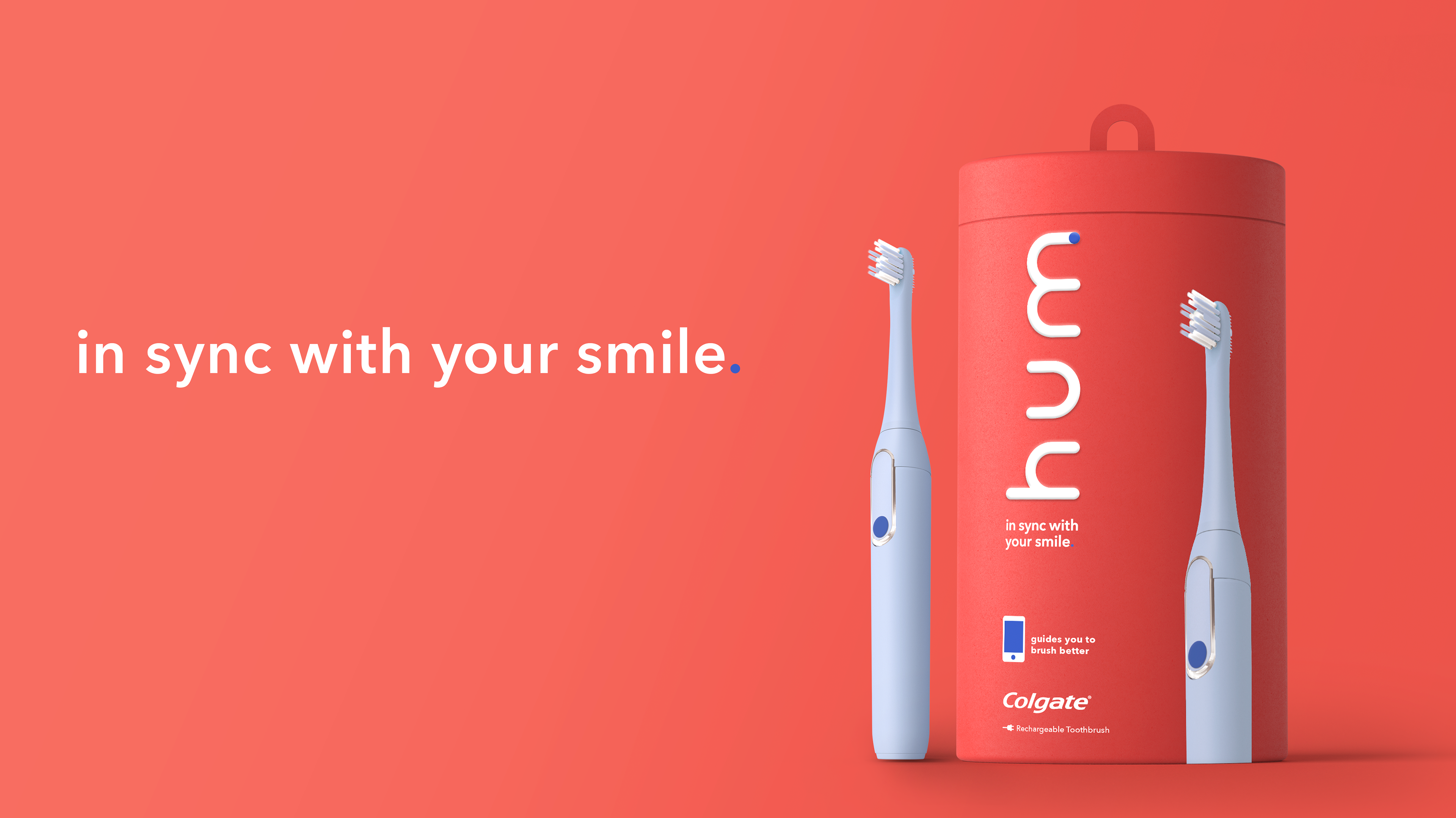
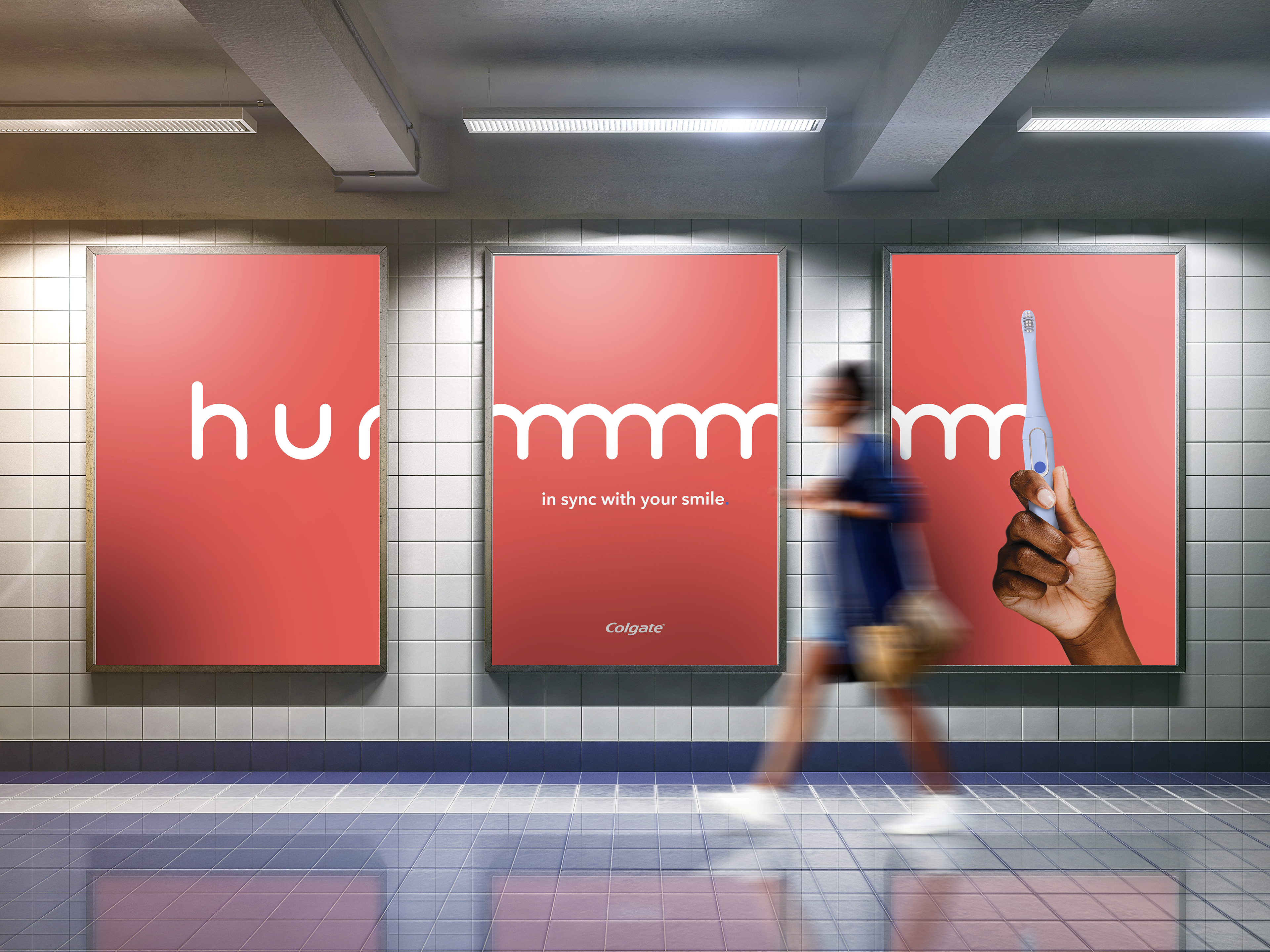
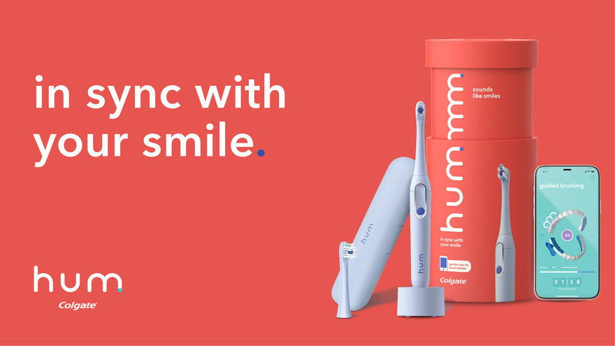
Designed a logo where the “m” visually mimics the brushing motion and starts to create a graphic visual language that ties back to abstracted teeth. It becomes a modern visual expression of the sound of clean, hence the tagline that grew out of this idea: “sounds like smiles”. The “m” of the logo is activated when the packaging is pulled up, making it a 360 tactile experience- the “m” starts to repeat and connect, linking us to the hummm that a person makes when brushing.
SCOPE
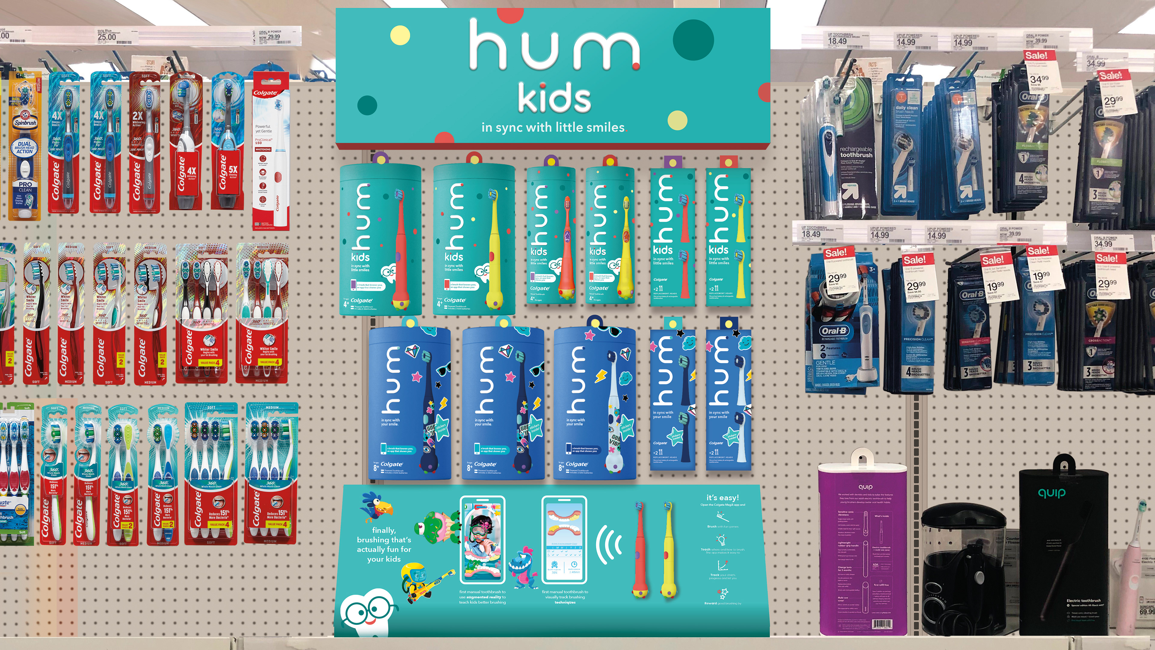
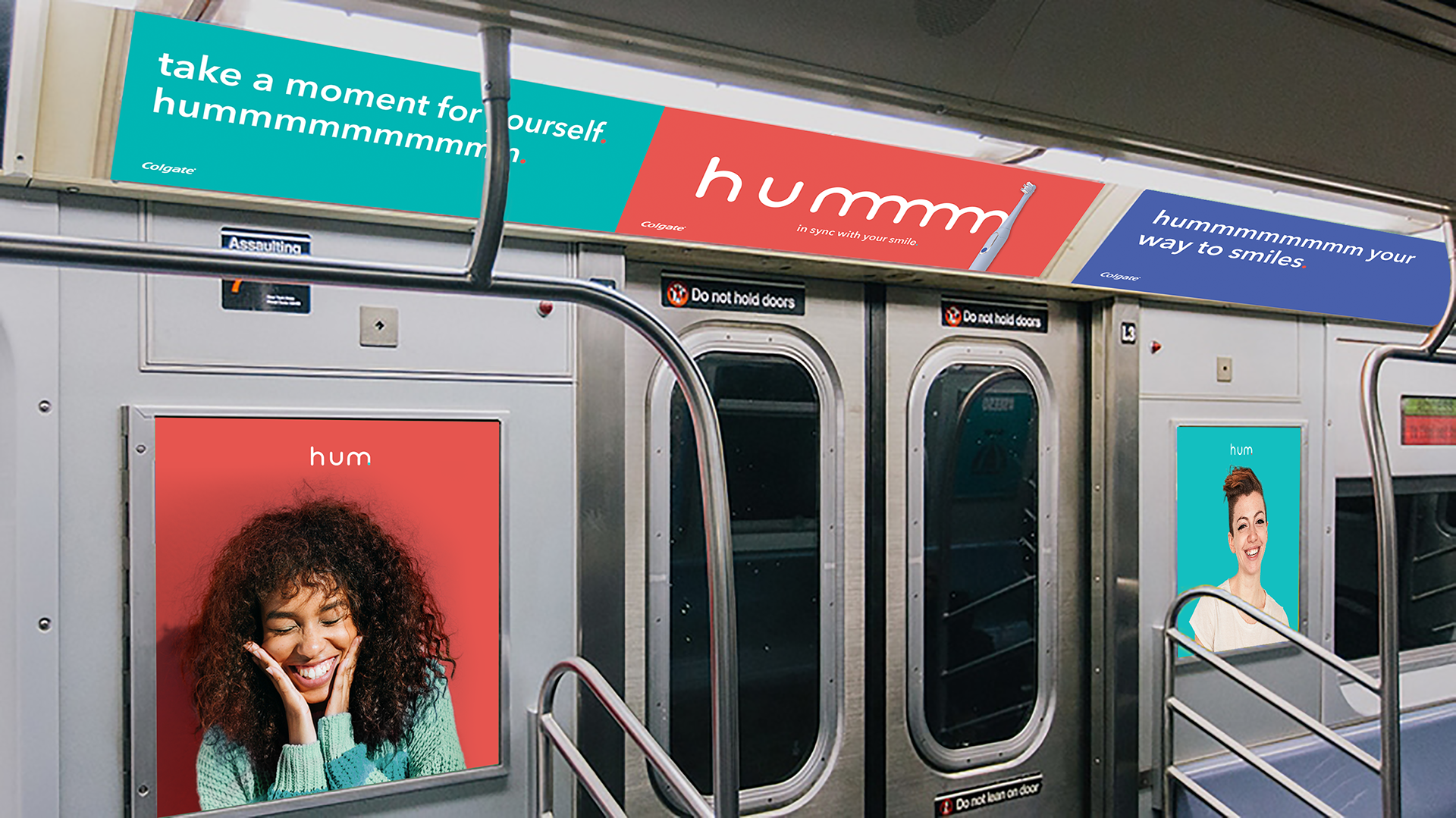
Designed visual identity, brand world and package design across various offerings, including how the brand would translate into an interactive app that helps with brushing. Extended visual language into social media, POP and marketing materials.
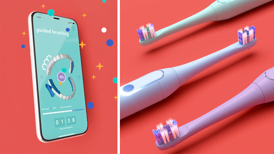
Level up your brushing routine with the hum by Colgate app! Designed to work seamlessly with their smart electric toothbrushes, the hum app personalizes your oral hygiene experience. Using Bluetooth connectivity, the app tracks your brushing habits, highlighting areas that might need extra attention. Earn points for good brushing technique and unlock rewards, making brushing fun and motivating, especially for kids. With the hum app, you can achieve a cleaner, healthier smile while enjoying a more engaging brushing experience.
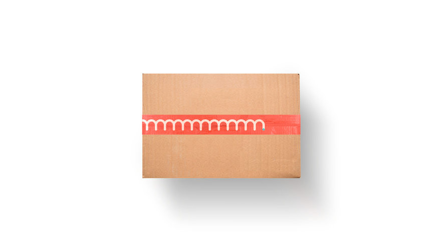
What are some ways to design a branded unboxing experience? By considering details like having branded tape that showed the up and down brushing motion that grows out of the hum by Colgate logo, of course! The flood of brand red on the interior of the box makes for a simple way to bring surprise to the unboxing experience. We also ideated around different ways the product could fit inside a box were this to be shipped DTC.
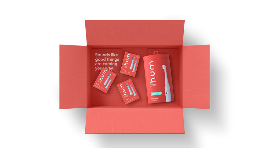
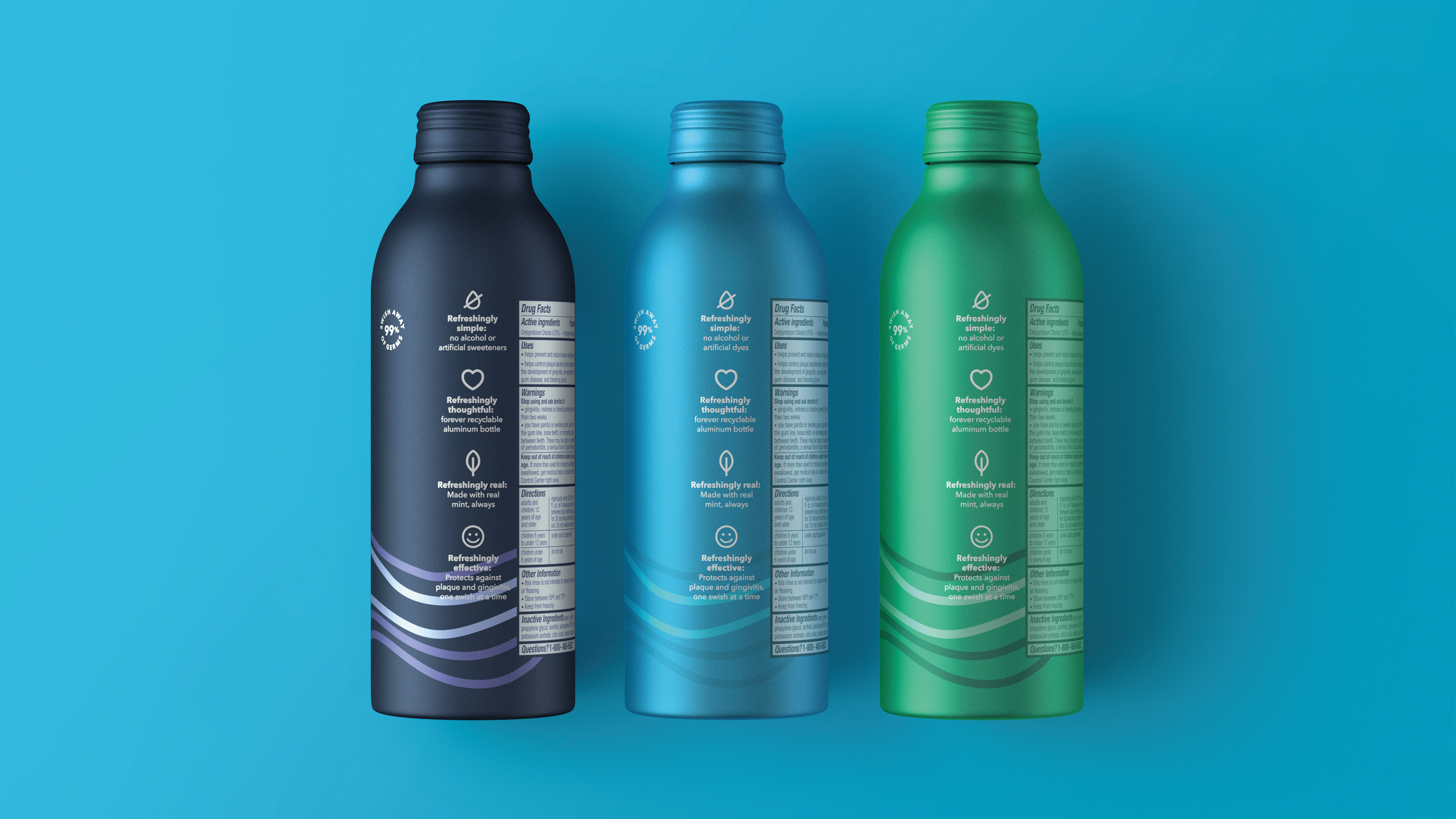
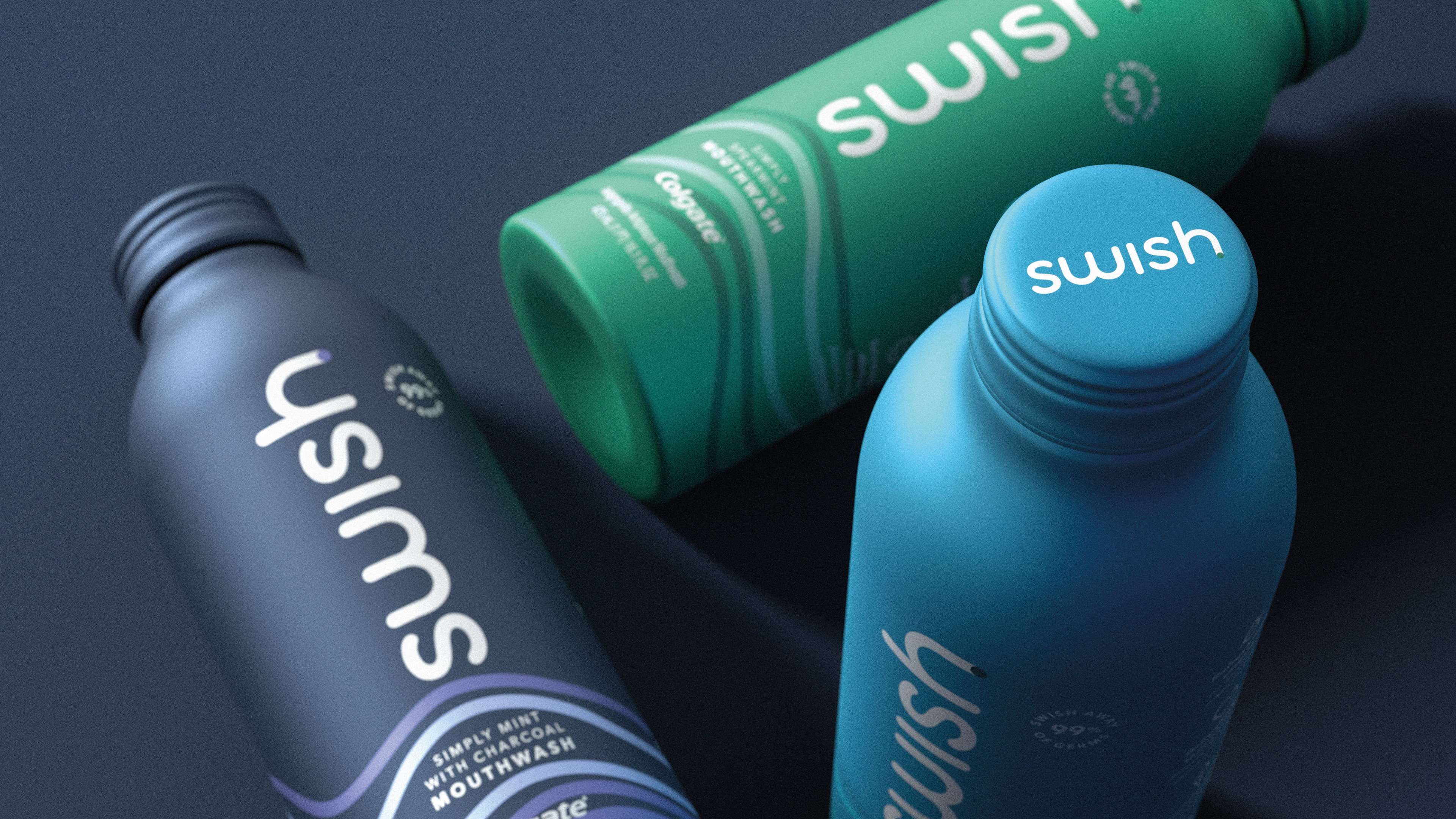
The hum by Colgate toothbrush was a big hit. It started as a DTC idea that went straight into launching at Target. From there, the product portfolio expanded to encompass mouthwash. In naming the mouthwash, we took the concept of bringing to life "the sound of smiles" and applied it to the name. What better name but SWISH, that signals the sound of mouthwash? The visual language was continued by having the graphics continue around the base of the bottles which were sustainably made out of recyclable aluminum.
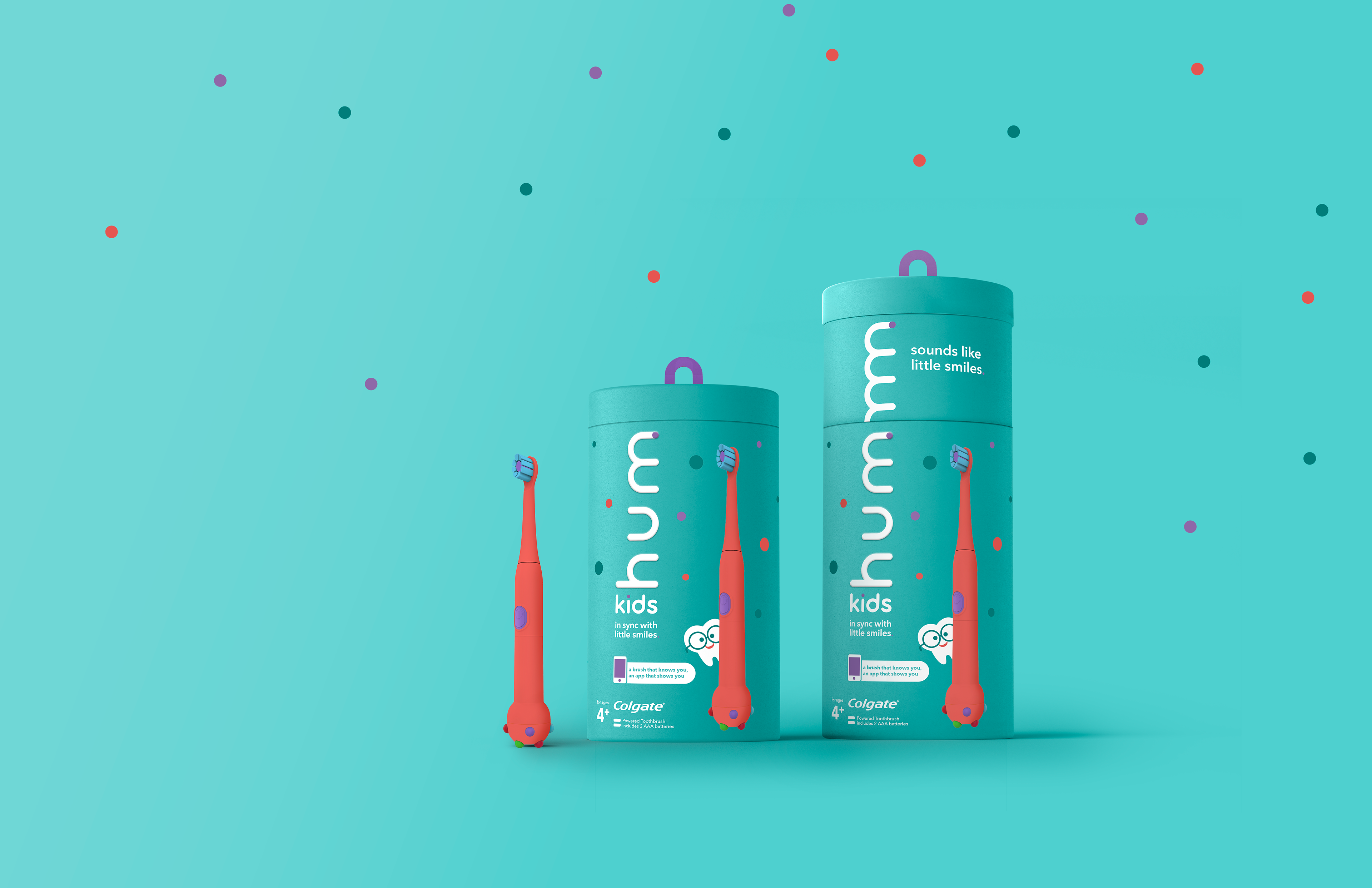
The hum by Colgate toothbrush family grew as well. How can we get the whole family enjoying the sound of clean? Design special brushes that appeal to tweens and kids. For the product below, we had the idea of making the product and packaging interactive by including a sheet of fun stickers. This would encourage our young consumers to personalize and embellish their toothbrush in a way that was uniquely them!
